Collecting and Writing From Vernacular Typography
Heartsourced, a web-based collective experimental writing project that documents happenstance instances of encountering vernacular typography in Chicago, doesn’t aim to be loud or remarkable. Instead, it quietly acknowledges the conscious decisions that keep the city a playground of visual artifacts: innovative small business displays, hand-painted announcements and antique signs. Rather than mourn the loss of unique instances of text amidst urbanization and gentrification, its goal is to explore the occurrences of words peppered within urban landscapes that are often overlooked in the rush of the day-to-day.
Many feel a disconnect between the head and the heart; thinking with one is hardly ever the same as trusting the other. Both are genuine, but evolve in different forms. The writing that is sourced from these encounters with found type in Chicago evokes a love of a neighborhood, a city, and a community; a method of thinking about text that engenders other text. The title hints at the practice of seeking sources, spaces and places that evoke a heart-centered documentation of memory. Hosted on a simple Tumblr, a plug-and-play publishing platform, every entry is happenstance but inscribed in some kind of heartfelt jolt or affinity for the character of the type.
Each of these floating texts, anchored by buildings, are somehow personally meaningful to me immediately upon first glance. I snap several photos on my iPhone and then return to them minutes, hours or days later to try to make sense of why I feel that connection. On Heartsourced, freeform writing accompanying the visual documentation ranges from formal analysis of the typography and its context to minute tangents on a sign’s relations to other aspects of design or culture. The common thread, as I am finding, is that they all hit on some infinitesimal memory, such as going out for Chinese food with my grandmother or remembering another instance of that same typeface in another country.
Heartsourced was originally developed as part of the SAIC Spring 2014 course Wired Writing: Community and Culture on the WWW. In thinking about the communications that we encounter through the “analog” forms of signage, I wanted to make a web-based collection centered on a physical community, then translated for a digital one. Right now the main focus is on the extremes of the paths of my own everyday: my relatively quiet neighborhood around Lincoln Square and the bustling area around SAIC. Through submissions from others, I want to expand Heartsourced to become crowdsourced, documenting instances of vernacular typography, and writers’ reactions, impressions and challenges from all over the city.
Visit heartsourced.tumblr.com to see the project and learn more about submissions.
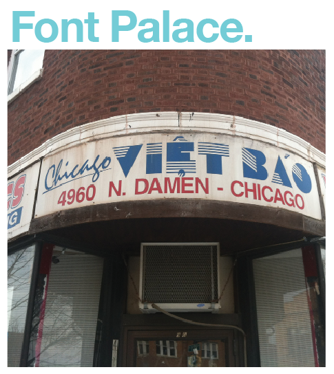
Argyle at Damen//1.18.2014
This is the sign that launched this project, a typographic smorgasbord.
My movements within Chicago are usually transfixed along paths dictated by timelines and train lines. Like many commuters and urban residents, the city is often nothing more than a tunnel of space. I often simply float through, unaware of my surroundings, too consumed by the chatter of my own mind. Glancing out of the window of my office on Michigan Avenue at the north courtyard of the Art Institute or counting the bicycles on the back porches of the two-flats along Ravenswood Avenue is usually the extent of my practice of looking at my city, as opposed to actually seeing it.
I finally realized on a bitterly cold winter day that Chicago is filled with a visual language that, if you look up and around, is playful, mysterious, and hints at time warps and time freezes alike. After downing plates of runny eggs, biscuits and gravy at a greasy spoon, I tried my best to dodge the puddles of slushy water coagulating around the crosswalks at the corner of Damen and Argyle, at the southeast corner of Winnemac Park. While waiting at the light of the intersection least plagued by the icy mess, I noticed the boarded-up sign shop with five different typefaces in less than a foot of space on the door.
Background research on this space has yielded little outside of business listings for Vo’s Graphics, which is proudly announced elsewhere on the building. But the fact that this is (was?) a sign and printing shop certainly makes sense for everything going on here. The clear winner in the hodgepodge of eighties-inspired lettering on the door is the treatment of the business name. It reminds me of the font that was on the sign of the video store near my childhood home where I would rent only the finest of Disney VHS tapes and buy POGs. The inversion and the shading of both the “V” and the “A” balance the rest of the conversation.
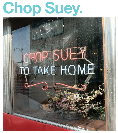
Irving Park at Ravenswood//2.9.2014
A little from column A, a little from column B.
There are few dishes in America that have as much mythology as chop suey. Once the reigning staple of American Chinese restaurants, it’s a mix of assorted meats, vegetables and noodles in a starchy sauce usually served over rice. The name derives from the Mandarin tsa sui — literally, “miscellaneous leftovers.” Culinary historians and anthropologists debate the exact nature of its emergence in North America, but the general consensus is that it underwent a transformation from a Cantonese peasant staple to Americanized comfort food over the first half of the twentieth century. From art school dropouts to middle class families, many Americans found their first forays into “ethnic” dining through the Chinese restaurant.
The thing about chop suey is that it’s a rather antiquated dish, kind of like those elaborate Jell-O molds or glazed hams with pineapple-and-cherry garnishes from the 1950s. It was pushed aside as an “inauthentic” concoction born in the U.S. in favor of “authentic” Chinese food. Nowadays, dishes like Cashew Chicken, Broccoli Beef or Orange Duck (again, mixing a meat with a vegetable/fruit/nut in any number of combinations) are far more popular for today’s palate. To order chop suey feels quaint or even awkward, like it’s from the time of smoking in supper clubs. Whenever I go out for Chinese food with my grandma, she will always order it even if it’s not on the menu. Instead, our server will point her towards the closest incarnation available, usually a kind of pan-fried noodle medley.
I noticed the signs announcing Orange Garden Restaurant on Irving Park at Damen immediately because of this throwback to chop suey, the thrill of going out to eat (or even ordering take out) so front and center. The typography here is a mix of everything together, just like the dish: the curved 1940s-feel to the text of the hanging sign (the “w” and “m” mirror each other, and that “e” mimics their curvature) meeting the 1950s diner feeling of the façade and the rigid font of the restaurant’s name on the building. The robin’s egg blue of the neon signs meshes perfectly with the tangerine façade, a mashup pleasing to the palate of the eyes.
Western at Lincoln//1.30.2014
It seems improper to not bring up Chicago’s relationship with Helvetica.
After growing up in Milwaukee and then living in Japan and Seattle for nearly a decade, coming to an urban area where one typeface permeates the landscape has been a first. The most obvious place you’ll find Helvetica is proudly announcing the CTA stops and on city maps.
I like to revisit Helvetica, the 2007 Gary Hustwit documentary, from time to time. As the film so brilliantly shows, Helvetica has it all, and for that reason people are bound to either love it or hate it. It can be beautiful, simple, bland, intellectual, utilitarian, egalitarian, dull or even oppressive, depending on where you look. It could be a deliberate, conscious choice or a total cop out. No matter what, it is undeniably here to stay and will pop up in interesting ways in any urban landscape. That typeface has a charming balance of ubiquity and playfulness, and as a modernism fangirl it still thrills me to no end that I see it daily.
Since Helvetica’s 50th anniversary in 2007, if not earlier, it seems to have found its way back into the collective eye. Especially with the explosion of sites like Etsy, where independent crafters and makers take production into their own hands and to the masses, everyone can enjoy a little slice of typography appreciation and let the world know it. There are t-shirts that read “Helvetica” in Helvetica which garner reactions ranging from eye rolls to pick up lines. At a knitting store a few months ago, I spied a young woman carrying a tote bag that immediately pinned her as a language nerd and a Helvetica fan.
It reads: “some days feel like Helvetica”
In some ways, that has become my mantra akin to something like “This Too Shall Pass.” Some days I revel in the comfort of the familiar, the “everything is going to be OK.” Some days I want to be told what to do. Some days I want to play. Some days are boring. Some are beautiful.


