

The title of this year’s Chicago Architecture Biennial, now in its third iteration, is “… And Other Such Stories,“ and its objective is site-specific: The exhibits aim to address head-on the histories and forces that shaped Chicago, and to reconcile them with the current reality of the city. As in past years, the main exhibit for the Biennial takes over the main galleries of the Chicago Cultural Center. Satellite events, like lectures, site activations, and tours, have been happening around the city, including at the Jane Addams Hull-House Museum in Little Italy, the School of the Art Institute of Chicago (SAIC) campus in Homan Square, and the former Anthony Overton Elementary School in Bronzeville.
This complex aim is perhaps why this year’s architecture Biennial feels and looks much different from the past Biennials, or, for that matter, any other design show. The 2017 edition’s exhibits were more anchored in the culture of architecture today, which can feel inaccessible to the general public. According to some critics, this year’s show was easier to digest. Blair Kamin, Architecture Critic at The Chicago Tribune, commended the Biennial, saying that this year’s show was largely free of the “archi-babble” of previous years (2015 and 2017), making it a better experience for non-architects.
But while abstract models and in-depth studies of mysterious architectural inside jokes are mostly absent from the 2019 edition, this show demands a different type of complex insider knowledge. Most visitors outside the realm of architecture probably won’t immediately connect the focal points of this year’s Biennial to architecture. This is because the Biennial takes an approach driven more by urban planning and sociology. In the Biennial’s defining statement, its subject is described as a “research-driven approach to historical and contemporary spatial conditions,” which aims to consider the forces that have shaped Chicago. This topic is broken up into challenging the definitions of property, considering a space’s role in collective memory, using space as a tool for advocating for human rights and nature, and engaging those who use space as a tool for advocacy. Concretely, this means addressing subjects such as sustainability, sovereignty of Native lands, imperialism, and redlining. While these are all subjects architects consider, they’re not ones that the general public would usually connect to designing buildings, because the politics of design is often hidden behind the finished facades that architects produce.

Perhaps revealing the politics behind architecture is what allows non-architects to understand the practice more deeply. After all, these are dense and complex topics, but they’re topics that most people are at least tangentially familiar with. However, this year’s Biennial isn’t different just because of its politics. This year is challenging in content, and that makes the design of the exhibits themselves challenging. The exhibits looked and felt so significantly different that I was drawn away from all the questions about land rights and the ethics of architecture and stuck on the question: What does it mean to go out to see art exhibitions in the digital age?
This question at first may seem irrelevant to the story told by this year’s Biennial. For the most part, the content is displayed in a fairly straightforward way. Politics and urban conditions are easiest to understand in a clear narrative formats: through documentaries, essays, infographics, or photo essays, for example. But all these forms, because of the tone of the subject matter, can be slightly dry. The Biennial this year was fated to be information-heavy because of its theme, but what I was excited to see was how architects translated that information into a physical space — how they put the issues in the room. The way many of the exhibits this year faced this challenge was, somehow, not to face it at all. Medium matters to interpretation; it cannot be set aside. And so I’d like to set aside the nuance and depth of the content itself, and instead narrow my focus to the medium in which the information is presented.
Many of the installations are highly digital. Contemporary artists often present information in a frenzy of screens, charts, and pamphlets, and they design spaces to accommodate visitors as they absorb the information. The most critical I can be is this: On the numerous times I visited, I tended to find myself wondering why it was more useful for me to get myself over to the Cultural Center than to sit in comfort at home, absorbing the information-dense videos, articles, and infographics that were presented by the artists at the Biennial at my own rate and in my own space. I struggled to fully process the nuance of many of projects because of their presentation.
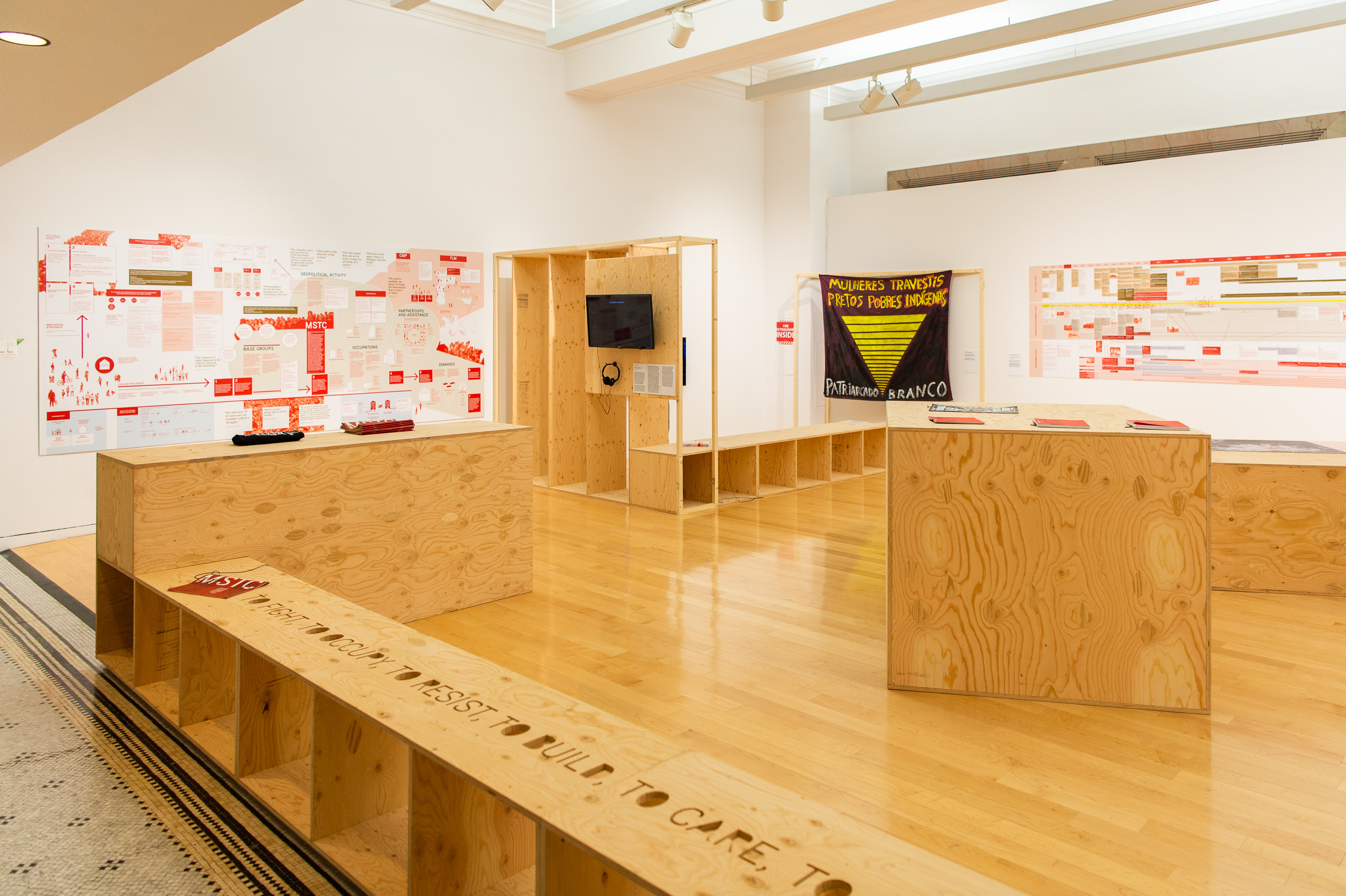
The first piece that made me wish I could simply look at it at home was the project Ocupação 9 De Julho, by Escola Da Cidade and O Grupo Inteiro. It documents the activities of the MSTC, Movimento Sem-Teto do Centro, an organization which aims to reduce homelessness through squatting in empty homes in São Paulo, Brazil. Large diagrams entitled “Diagram of interactions MSTC: Citizenship Factory” documenting class interactions dominate the walls, while interviews play on screens embedded in a wood installation. The diagrams are dense, a massive laser print of text boxes and labels. You can skim them, but you can’t really do them justice in one or two visits.
It would be one thing if they were part of the design space in the exhibit, but the wood installation almost seems dismissive of the printouts. To me, it seemed as though the story unfolding in the diagrams was the star of this particular exhibit, but it was simply tacked on the wall, missing an opportunity to use physical space to make the viewer understand the subject on a deeper level. This was an exhibit I could have picked over for hours at home and understood better, without worrying about how I was hogging the headphones for the video displays or blocking someone else trying to read the diagrams.
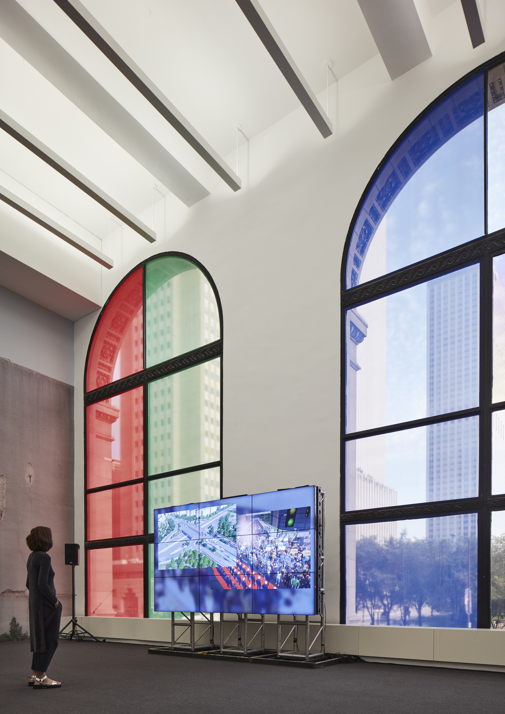
Another piece that fell flat for me was “Transformation Scenario,” a video installation piece that presents research simulations used by urban planners. Made by German artist Clemens Von Wedemeyer, it demonstrates what is to me a misunderstanding of how people enjoy video exhibitions. My simple complaint is that the video is twenty minutes, and there is no chair in sight. Is standing for the entire duration an intended part of the experience, or does the artist simply not expect the audience to have the attention span for the full viewing?
With the increasing dominance of digital media in storytelling, why design the physical at all? The deeper I walked through the halls of the Cultural Center, the Biennial became less a collection of exhibits and more an argument for the importance of designed physical space.
Some pieces in the Biennial argue beautifully for the necessity of physically experiencing the installations. “The Gun Violence Memorial Project,” designed by MASS Design Group, consists of a haunting collection of small glass houses on the first floor of the Cultural Center. Lined up like gravestones and adorned like shrines with the belongings of those lost to gun violence, they would not have the impact they do without the use of space. The collection of objects, the echo of the recordings playing in the houses, the little glimpse into the lives lost — these are all impacts made by physical presence.
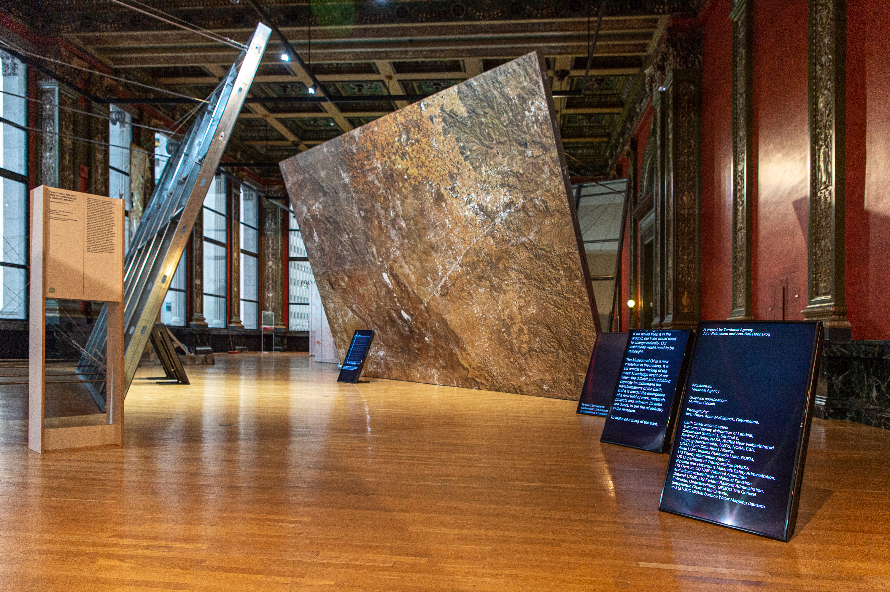
Upstairs, “Museum of Oil — The American Rooms,” by London firm Territorial Agency, looms over the viewer. Purposely dirty-looking smears of oil on massive metal panels tilt ominously throughout the gallery. The physical space is transformed. The viewer cannot avoid a sense of anxiety and foreboding while standing under one a representation of the culprits of the current climate meltdown. An extra layer of depth is added when the viewer realizes that BP sponsors the Biennial.
In “The Plot: Miracle and Mirage,” Chilean designers Alejandra Celedón, Nicolás Stutzin, and Javier Correa use video to recount the effect that the “Chicago Boys,” Chilean economists trained in neoliberal economic policies at the University of Chicago, had on Chile in the ‘70s and ‘80s. The installation invites the viewer to step up to a narcissus pool-like structure playing a voiceover and a satellite video of Chicago. It’s a simple installation, but effective. I stood looking into the mirrored box with a group of strangers. At certain revelations from the voiceover, we exchanged looks across the screen. The combination of the engagement of the body, the inclusion of mirrored walls, and the physical depth of the installation created a spatial effect that made the story more engaging.
Whether or not a piece manages to argue for the value of art exhibits in an increasingly post digital world, they all succeed in revealing something about the value in the intangible qualities of physical space. Physical exhibits, of course, are not on their deathbeds. The most impactful work from the Biennial reminds the viewer of this fact, and of the potential that architecture still has to instill space with meaning.


