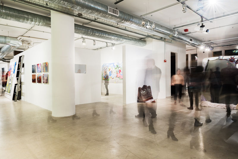
I often hear jokes about being a student at the School of the Art Institute of Chicago (SAIC). Of course, they usually have to do with septum rings and the overuse of the word “aesthetic” or “conceptual,” as those seem to be the easiest targets. F has even, once or twice, mocked the pretentious (and the frequently nonsensical) language of artists. At the fall 2015 BFA show, which opened its doors for a private reception on November 20, I expected to find plenty of fodder for these jokes; but I was proven wrong and found out something really wonderful about being a student at SAIC. The show felt completely unpretentious, which one might suspect could have come from the free wine and beer provided by SAIC. Actually, though, it had much more to do with the relief most artists felt completing their last step towards their BFA degree.
Students dealt with ideas of anxiety, agency, nostalgia, artifice, and human need. Some seamlessly weaved between themes, acutely aware of the pieces’ effect on the viewer, and took careful consideration with interaction.
Megan Finch, a fourth-year student whose work was in the show, used a raw canvas with screen-printing technique and acrylic to transfer her piece, “Perfect Montana,” onto the wall. It was something that confounded most viewers, because the work looked like it belonged on a canvas, but as I watched, each viewer went to the side of the piece, looking for the thin magic layer, and were always surprised, pointing to their friends or loved ones that this was on the wall.
Somy Kim, a fourth-year student in Art and Technology, created a zoetrope for her piece “Need,” imitating (and modernizing) the nearly 3,000-year-old Persian animation technique. She created an installation that showed her acute awareness of relationships between humans, as her piece required one person to stand in front of a distance sensor to activate these animations so that other viewers could see them.
Each student I spoke with about their pieces had incredible things to say about their conceptual practice and what it meant to them that their piece was in this show.
It is worth noting that, as every year, the BFA show varies remarkably. From mixed media installations combined with poetry, to sculpture, to sound installation, to large-scale paintings, there were no two works that struck were even similar.
One of the greatest achievements of the show was a small space located to the left of Sullivan Gallery titled “Gallery > 53.” Set up by undergraduate Carolina Poveda, a fourth-year student concentrated on photo and fibers, the poster in the space indicated that “Gallery > 53” was not her own gallery, but she used her “privilege as a student of this institution” and created a space for artists who work outside of SAIC because, as she put it, “They deserve recognition, visibility, and access.”
The six total artists represented in “Gallery > 53” were Chicago, California, Texas, and Maryland. Containing a variation of artist works — including sculpture, photography, and installation work, the gallery was an excellent example of art as activism. A poster outlining Poveda’s vision made the viewer aware that there were greater social and political forces at work in the show.
“Having gone to this school I will leave with multiple connections and access to scarce resources, so I figured that my last big show as a student should be a piece about accessibility, which is something I work with
a lot already,” Poveda told me.
The show indicated that to be a successful student at SAIC, each undergraduate had to develop a tactical sense in their conceptual practice, being aware of the myriad ways that their art could affect the viewer. They created themes that were important to them, utilized their skills honed over the past years attending studio courses at the school, and were ultimately tremendously important.
I spoke with some students at the show about their work, and what how these pieces fit into their practice.
Somy Kim
“Need”
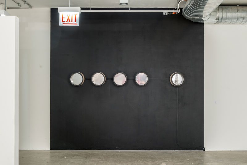
This piece is made from plywood for the structures, the inside elegus drive for the blinking lights. I used 1-⅛ inch acrylic sheets for creating the animations, and the distance motors and distance sensor. There is distance motor inside each of these pieces so the distance sensor controls the speed of the distance motors. When the motors are activated and spinning really fast, the LED lights start blink, and it then creates the animations. An easy way to think about how the animations are made is to think about a pizza, but each part has a different image, so that when it spins really fast, each frame combines and creates an animation, which is the basic function of the zoetrope. There is a distance sensor inside of the sculpture so the rest of them act as zoetropes, and because of the distance sensor inside of this sculpture, someone has to be standing in front of it in order for the entire piece to work. Ironically, the person standing in front of this sensor cannot see the work, but they need to be standing there in order for other people to have this experience. So that’s the purpose of why it was created, I wanted to talk about physical relationships, so I “Need” someone.
Joan Yubin
“I heard you were coming, so I ate the cake” and “Project”
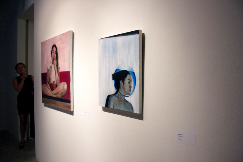
I created these two pieces with oil paint on linen. I think a lot about my place in being a part of this time during some pretty rapid advances in technology, and readily available technology to almost everybody in first world countries, and the way that changes how we value the moments we live through. I think with all of these snapshots we are able to take every day on our phones, selfies et cetera, it’s important to capture your moments as though you are somehow capturing yourself in them, like they used to be. I’m not suggesting that we regress or go back in time necessarily but just to reinvestigate what it means to be represented in a time of endless possibilities of representing yourself instantaneously.
The “Cake” painting definitely has more to do with societal norms, what kind of behavior is accepted and what’s not. I just kind of thought it was funny, this image of me eating a cake with my bare hands kind of goes against everything my mom might’ve taught me is ladylike. It was a fun way to rebel against the things that might be expected of me.
Sidney Tilghman
“On The Hunt, Green Number 2” and “Good Form”
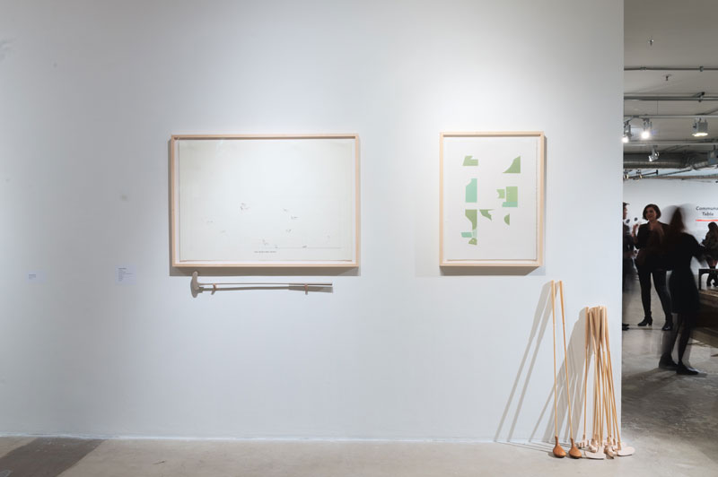
One is a print and drawing and the other is a woodblock relief print. The sculptures are just wood, done in the wood shop. I have a background in architectural theory and criticism so I kind of started there and I was working a lot with the landscape. I joined a rowing team over the summer, so I became very interesting in how people interact with the landscape especially through sports and activities. I’ve also worked at a putt putt and I’m from Virginia where fox hunting is somehow still prominent.
Sae Jun Kim
“Sidewalk Trees”
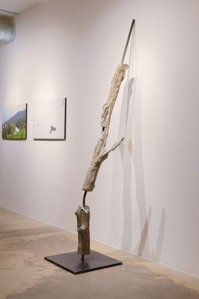
The sculpture is made of concrete. A tree was molded and casted using concrete onto the rebar. The object I was casting is a tree, which I casted with a rubber mold, and fit it onto this metal bar, and then poured concrete into it. This piece speaks to the made up world that we live in; when we’re in a city or urban area we long for nature, so we bring it in, but it’s manicured.
Just like a sidewalk tree, a single tree growing in a square box is not supposed to occur in nature. So I’m not saying we shouldn’t have sidewalk trees, but maybe I’m saying that we should look at it with the focus of it being out of place.
Mark Citerone
“Relentless Antagonism”
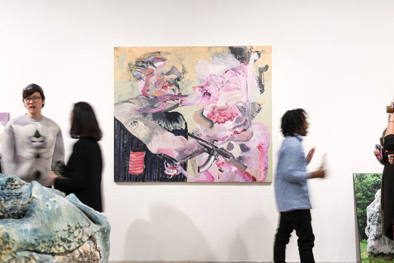
This painting was done on stretched canvas, cotton duck canvas on Stretcher bars. This piece involves all water-based media, acrylic motion based paints, vinyl paints, also known as flash and minwax enamels.
For me, painting is a practice of working out conflict through material, it doesn’t necessarily have to be with paint, but, I come from a tradition of drawing, and so my paintings end up like effigies of my thought patterns and processes. This painting is about interpersonal conflict and structures of hierarchy, having agency and power over another person and the kinds of situations that this sort of thing results in.
Megan Finch
“Paradise Montana”
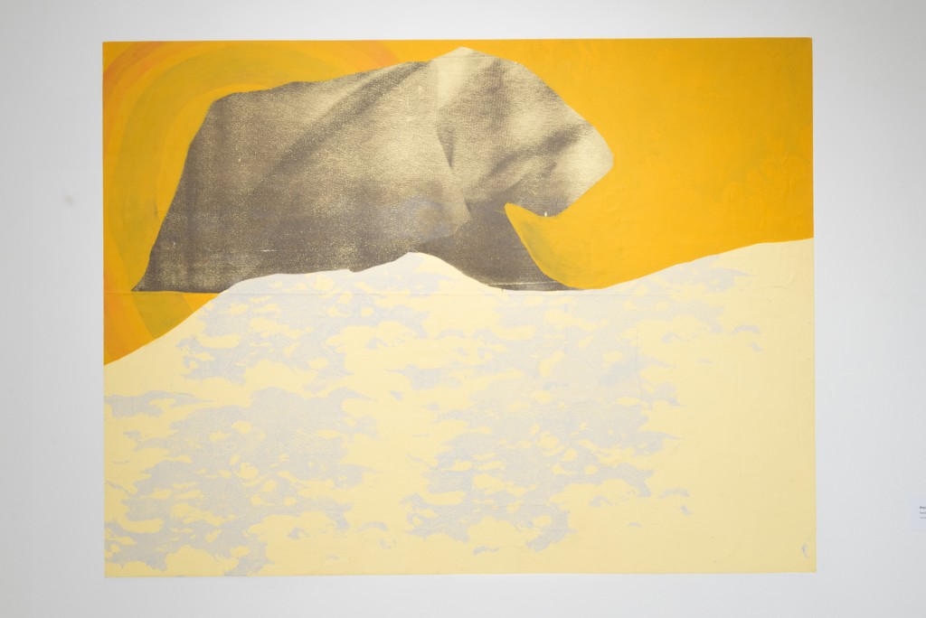
I did the painting on raw canvas with screen print and acrylic, and I attempted to embed it in the wall, which turned out alright. I work a lot with landscapes, sort of thinking about the loss of the ideal, nostalgia, and altering memory. The move to place it in the space was more of a move to make the audience feel the same way that I do about the image. Not so much an image I’ve placed for them, but something that exists in my mind or in real life. The mountain shapes I used to reference my experience growing up in Montana and sort of the family histories or imagined things that now exist there for me. And then there are also references to a sort of cartoonish happiness, and this sort of figure-animalistic thing. To me it says that something lives here, not necessarily something you know, but something that feels familiar.


