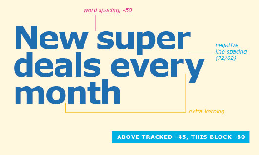
Three legitmate differences that need to be taken into account when using a screen font on paper.
By Matthew Carter
 1. In working on Verdana I tried to think of it at the paragraph level. The spacing between letters and between words was every bit as important to legibility as the bitmap forms — in fact probably more important. Earlier screen fonts that had been adapted from printing types tended to have irregular spacing, characters touched or had spaces between them wide enough to be read as word-spaces. The spacing on screen is governed by the same coarse increments as the bitmaps themselves; the net effect of making the inter-character fitting more even was to increase the side-bearings and loosen the spacing. The enhanced legibility of open fitting is also helpful in small text sizes in print (and paradoxically in signage), but at display sizes in print it may make the type look gappy and hard to read because the letters don’t cohere well into word-shapes.
2. By the same token, kerning on a coarse-resolution screen is unsubtle. A screen font probably has fewer kerning pairs in its table than a printer font.
3. Verdana is a two-weight family: Regular and Bold. In the mid-’90s when I was working on these designs the screen pixels from which bitmaps were built were binary — on or off. There were only integer pixels, no fractional pixels. Therefore, if the stem-weight of Verdana was a single pixel at a certain size on screen, the only way to make a Bold face was to double the stem-weight to two pixels. This represents a bigger gain in weight between Regular and Bold than is customary in print sanserifs. On screen the extreme contrast in weight and width of the Bold is good, it makes the distinction between the weights unambiguous.


