In the city, there is no escaping the constant bombardment of brand names. Highly-polished men and women beckon you to buy things you don’t need, to get a better education, to eat food that is photographed better than it is digested, and to mire yourself in insurmountable debt. For a business to survive, it needs to successfully compete for the attention of an over-stimulated populace. To manage this, brand identity—and the brand’s focal point, the logo—is of prime importance.
Logos tend to be deceptively simple. With a few stylistic traits, a logo separates one product from the next, and can even send subliminal information to a consumer. For example, a logo with a sun or a lightning bolt, and the words “all natural” or “pure” on the label can make the hapless shopper think that they are buying a health or energy drink, no matter how much high fructose corn syrup is packed inside.
Quick visual association is also important for brand loyalty, which may have little to do with the relative merits of a particular bank or cell phone. Because of the iconic nature of these images, the decision to change logos is not made lightly, and is often an attempt to become hipper (like Doritos’ constantly changing looks), to change with the times (Kodak), or to distance a company from past negative associations (KFC now avoids that unpopular fried connotation).
Even when a logo is diluted by inconsistent implementation, as the School of the Art Institute’s was, an attempt to unify the brand can be a harrowing experience.
As we reported in our December issue (“A year in the making, the school’s new logo emerges,” page 10), the school developed their new logo in connection with two different non-SAIC-related companies and an assortment of student and faculty focus groups. Despite the year-long effort, the roll-out of the new logo has not been happily received by much of the school community. Some eyed it with the casual disregard and sarcasm of the aloof artiste; a few students in the Visual Communication department felt snubbed; others didn’t even notice the change.
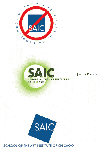
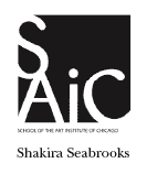
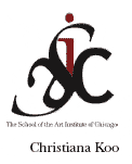
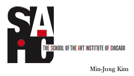
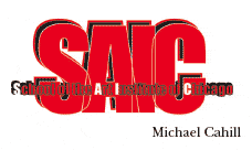
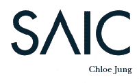
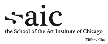
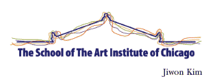
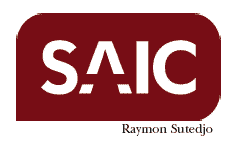
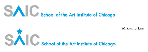
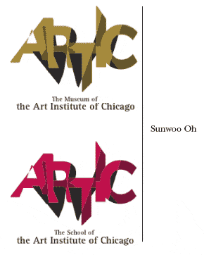
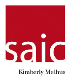
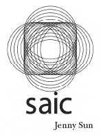
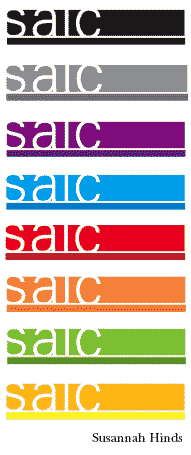
In view of these responses, F News decided to act. And act we did. To elevate the level of discussion above snarky muttered complaints, we decided to hold an informal logo contest. Here we present a selection of the best, worst, and silliest logos submitted by our readers. In addition, one VisCom class took up the challenge in the form of a class project. Emulating a real-world model, Dave Philmlee’s Brand Identity students first discussed their impressions of the school as a group, considering how they saw the school and what they felt were its key qualities. They then developed casebooks, in which they researched logos from competing art schools, refined their descriptions of SAIC to 3-5 words, and presented their logo, its color palette and its suggested usage. For example, Tiffany Cha chose the words “non-conformist, Chicago, dialectic, collective” and “interdisciplinary” as core indicators for the school.
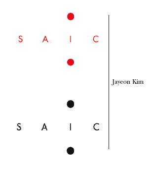
Some students used the new logo as a starting point, tweaking it to fit their perspective. In her casebook, Kimberly Melhus writes that she “decided to keep the box from the new logo and the black and red colors from the old logo and bring them together for a more unified feel.” Others departed from the new design in order to emphasize other elements. Jayeon Kim’s design highlights the “I” in SAIC, stating in her case book that, “SAIC’s history and confidence [grants] the most liberal and personalized education systems to each individual student.”
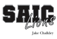
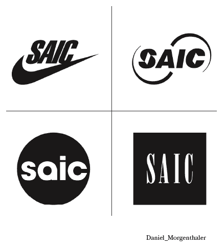
Others contestants chose to make satirical logos, like Jake Chalkley’s letterman jacket style, or the corporate commentary in VisCom Adjunct Associate Professor Daniel Morgenthaler’s quartet of subverted icons.
In the end, it is unlikely that a community as diverse in taste and as independently-minded as SAIC would agree upon a single image to represent the organization. But the new logo will only provide a stronger sense of cohesion and professionalism to the outside world. The rest of us can do with it as we please.
So who won? You choose. Vote online at Survey Monkey for your favorite logo, and we’ll announce the winner HERE in our May issue.
