by Anne Knight Weber
By redesigning the space on the eleventh floor of the Sharp building, Stephen Farrell, associate professor of visual communications, aimed to create a more cohesive community of visual artists, improve the quality of teaching and learning situations, and provide more chances for collaboration in the Visual Communication department at SAIC. Renovation of the eleventh floor cost $1.3 million dollars and was completed over the summer of 2008.
Unchanged since the late eighties, the visual communications floor was a corridor of doorways, and teachers struggled to maintain eye contact with students in the long narrow classrooms. Farrell’s approach to this design project reflects his mission to provide space that invites connections between creativity and community. “For me what started this whole project was that we just seemed to lack a sense of community here. I would go and tour these other schools and the students all knew each other. I felt like the architecture can really influence the sense of community,” he said.
Farrell started making design sketches for a more open space in 2005. “A lot of what I was basing this on is the way the design studios look and feel. A lot of them are in these loft spaces or these great spaces, the students go and intern there and they see these great spaces. They work in these spaces. Then they used to come back to what felt so much before like school, archetypal schoolhouse settings. I wanted to open it up and make it feel kind of like hip design studio space feeling. Then we have incredible views…a beautiful space for dreaming. Its just a great way for us to be connected to the city.”
 Farrell walked me through the remodeled eleventh floor space on his lunch break between classes on a Tuesday. He described the floor’s look before the redesign, the tall, bright-red lockers that looked like high school, and pointed out where boarded up windows and skylights used to block out light and great views.
Before the redesign, visitors to the eleventh floor stepped off an elevator to be met with a wall and were forced to find their way around corners to see a receptionist.
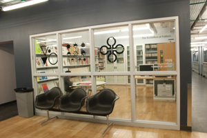
Now an open lobby greets a person’s exit off the elevator, with wide warm blond wood floors and clear views through glass walls to the windows facing daylight on Monroe Street. A receptionist sits next to custom-built blond wood magazine racks facing out to the lobby. We started down the hallway, which once was narrow with a dropped ceiling and tall, thin lockers. The new lockers are deep squares, a better size to store laptops and three-dimensional art. The hallway has a vinyl tile floor and is wide, even including an inviting bench seat built in along the wall.
We entered the old computer room. “The lighting and acoustics were so bad in this room, we ended up not using it for teaching,” Farrell said. The room was too big and long. One of the things Farrell asked for in his redesign was smaller rooms. “The administration bought that,” he said. Before the renovation, “It was a really awkward space.”
Farrell said, “When I did a survey of kinds of classroom, I found that there were roughly four kinds of classroom needs: media capabilities, seminar space and two kinds of studio classrooms.” One classroom type is “dominated by working with your hands and working on a board.” In the old classrooms, “We had large steel desks, but the steel was always really cold.” He emphasized using floors of blond wood that felt warmer for the new spaces. The other type classroom includes more computers. “Each of the rooms is hardwired, so you can stand up here and give a lecture. The classrooms are set up so that students can cut draw, scan, print, make photocopies of what they do and make a mess and spread out. So this becomes a full production environment,” Farrell said.
Farrell got the idea to use glass windows to separate classrooms from studying the architecture space in the Sullivan building. He wanted small spaces that still gave students the chance to look ahead at projects or get inspired again by looking back to see first-year students working on a project for a foundation class.
He said, “The space is important for the way they approach the work and the way they approach each other. The teacher would be able to see everybody, and nobody would have their back to a presentation.” His solution was to set the desks at one hundred and twenty degree angles from each other, with easy options for reconfiguring the furniture to accommodate different needs.
His challenge was to come up with furniture that was planted down to be hardwired and that could be flexible. “I spent a long time trying to figure out how to put furniture into these spaces,” he said. He found tables from Steelcase that are easy to move in a matter of minutes. To accommodate critiques of small work, such as books or tables of contents around a table, take two half rounds and put them together. “The thing I really liked about it was the half-round table, made it possible for collaboration to be part of the solutions we are looking at.”
For the walls at the front of the class where a chalkboard used to go, he had another creative solution: a grey polymer board that does triple duty. It’s a place to pin up work with magnets. It’s a projection screen, which means there’s no need to pull a screen down anymore, and it’s a whiteboard.
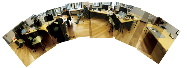
Before the renovation, thirty-two professors and instructors shared one office. Now, each of the full- time faculty has designated office space. The staff area boasts a wide modern table, gathering spaces, sliding drawers to store artwork and teaching supplies, and easy access to the department head and the administrative assistant, whose offices are next to each other. “I am really proud of the office space. It’s palatial and we use it. We are the third largest faculty,” Farrell said.


