The artist as “anti-hero” is a modern concept. Think Jackson Pollock in his bookless studio, chain-smoking, and degrading a sacred canvas with plasters of paint and shoe prints — an encounter that is the direct inversion of Michelangelo’s “Creation of Adam.” According to an interview with curator Josh Dihle on the Student Union Gallery’s website, “Anti-Heroic” was the working title of the group show at Parallax Gallery in September. The name ultimately chosen for the exhibition was “My Ghost at Home,” but the aesthetic hedonism remains.

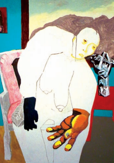
It is the figurative paintings by Gil Riley that most closely reflect the “anti hero” theme in both form and process. It was also these paintings that repeatedly forced me back to Parallax Gallery.
The paintings by Riley, an arrangement of large, capricious planes of color, resolute lines and unexpected figures, are a balanced combination of chance and spot-on decisiveness. There are primitivist and expressionistic qualities to Riley’s work — a crudeness of form and lack of unified perspective and depth. Still, the effects of these devices avoid the violent descriptions associated with Willem de Kooning’s works, instead expressing benevolent irrationality.
“This is My Ghost at Home,” the painting after which the show was named, features an image of a slumped woman, one large squash-colored hand extending nearly past the picture frame. The pose is incidental, avoiding any easily interpreted body language and allowing the painting to be seen as a series of tenuously and grippingly connected parts, without a restricting narrative.

The other work in the show, which closed on September 23, included sculpture and painting by Josh Dihle, and woodcuts and painting by Brian Rush. Dihle’s work ranged from a boulder-sized pink Sculptamold head, deflating in the center of the gallery, to small decorative landscapes on the back wall. The pieces Dihle chose to show vary widely. They do, however, share aspects of repetition in ways that are not immediately recognizable. In “Banana Painting,” a gang of mostly muted multicolored blocks converge at a glossy ceramic banana embedded in a wooden panel. In “Garden,” patches of foliage emerge from a field of white; evenly distributed, the shrubbery becomes a vintage wallpaper design. The connections found in Dihle’s work are tenuous but found most firmly in tone rather than theme — none of the pieces take themselves too seriously. There is a sense that Dihle makes these pieces because he wants to, with no justification necessary.
However disparate Dihle’s work is, Brian Rush’s pieces adhere to a consistent vocabulary. The paintings and woodcuts are depictions of a colorful fantasy landscape. Uncomplicated colors mingle with a myriad of basic shapes to produce simple, imaginative environments. Rush’s strongest piece is a six-layer woodcut. It utilizes the curvilinear forms and anxious lines that appear in his other work, but the print medium adds cohesiveness, and more complex hues provide a gratifying overall image.
In the interview on the SUGs website, Josh Dihle explains his reason for changing the name of the show, “The idea of the anti-hero was appropriate, but ultimately, the art speaks for itself, and I felt that an overly didactic heading for the show would restrict viewers’ sensitivity to what they are seeing.” The final title successfully adds a lyrical quality to the show by focusing on its emotive rather than thematic aspects. This decision illustrates the thoughtfulness of Dihle’s curatorial hand, nudging the strengths of the show to the foreground.
Resources:
Exhibition Press Release
SUGs photos from the exhibit


