

I do not foresee a stable economic structure for the current NHL season, which began on Jan. 13. Like every other sports league suffering heavy financial losses during the pandemic, the NHL needs to boost sales and bring in money — and what better way to do that than a partnership with Adidas to create the brand-new “Reverse Retro” jersey collection? Officially named the Reverse Retro ADIZERO Authentic jersey, these 31 completely new jerseys will be added to every team’s current uniform rotation, and will be worn several times during the 2021 season.
Not only do fans have the promise of “old and new” rivalries (which gets very exciting with a full-contact sport like hockey) thanks to the realignment of the league’s divisions, but these new rivalries might boost sales a little bit too by adding value to teams whose jerseys don’t generally sell as well as other teams. The other selling point is nostalgia. For the past few years, revamping vintage jerseys has become a successful way for sports leagues to increase their consumer interaction. Take it from the NHL’s Chief Brand Officer and Senior Executive Vice President, Brian Jennings, who said in a recent interview, “The Reverse Retro program is a celebration of the hockey jersey’s confluence of nostalgia, style, and broad appeal.”
This really is a far-reaching collection. The “throwback” touchpoints appeal to older fans who remember Stanley Cups of the past, while also capitalizing upon a younger audience with Adidas’ unique designs that fit seamlessly into the current popularity of streetwear and athleisure.
Since the jerseys dropped, the sports world has been obsessed with them, and fans definitely have shared their thoughts via social media. I have some thoughts of my own. Like, for instance, why the Detroit Red Wings basically just created a really expensive practice jersey. Or if Adidas really put the fan-dubbed “meth bear” logo on the shoulder of the Boston Bruins jersey. (They did). Each jersey represents one worn in a previous season in which something of cultural significance took place. Take the Las Vegas Golden Knights: The design pays homage to the legendary Manon Rhéaume, the first woman to play in any major North American pro league, who was in net for the Las Vegas Thunder of the International Hockey League in the ’90s by the striping. (Rhéaume wore similar striping on her jersey).
There are 31 jerseys for sale. As much as I would love to critique all of them, that’s too many jerseys, even if we can ignore the Edmonton Oilers’ because it’s basically their regular season jersey (sorry). So instead, I’ll leave you with my top five picks, plus one iconic honorable mention, that are maybe worth your cold, hard cash. Maybe.
Katherine Pitré’s Top Five Reverse Retro Jerseys (That Are Maybe Worth Your Money)
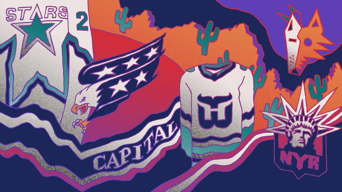
1: The Washington Capitals
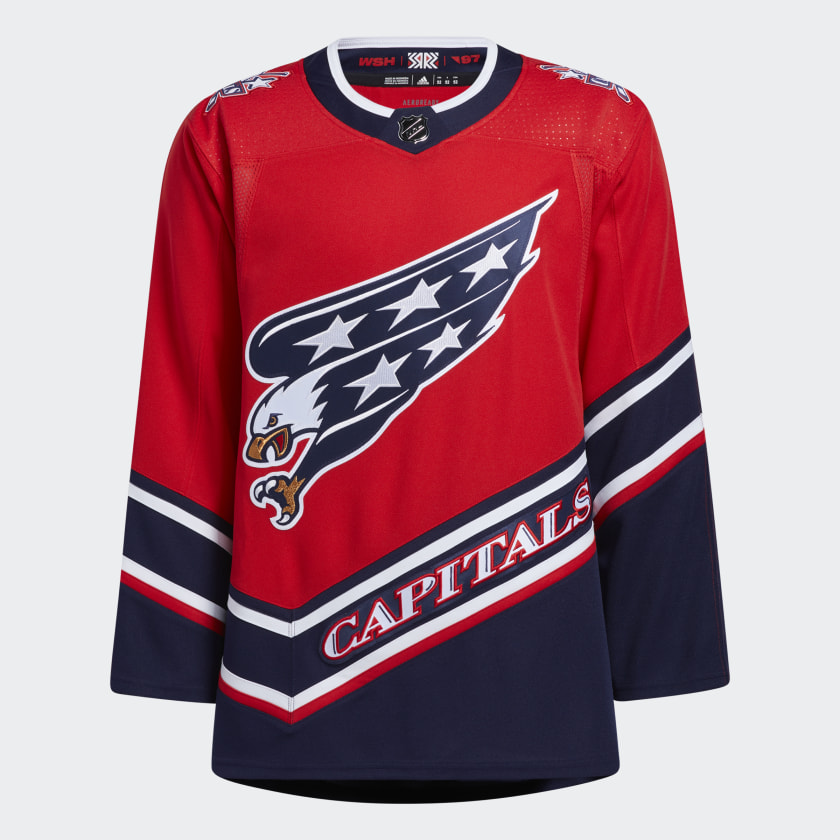
Based on their 1997 jersey, the screaming eagle is back! I love the side striping and the wordmark (which is a little controversial — a lot of fans hate the wordmark jerseys). For a team based in Washington D.C., their new jersey isn’t as vibrantly patriotic as it could be. The red is a bright, berry tone and the blue is a rich navy, both of which are muted enough to not be blinding. The design feature of the asymmetrical stripes that connect through the sleeves and bodice are a unique element that none of the other reverse retro jerseys lean into. The dome capital logo (introduced in 1997) that sits on the shoulder is the one aspect that I’m not sold on.
Overall the logo and lettering have some really fun contrasting embroidered details (such as the gold on the eagle and the shadow marks on the wordmark) that the shoulder patch really doesn’t capitalize upon. Since the jersey is red, and the patch is highlighted with red … well it just sort of blends in. This jersey is still one of my favorites because it encapsulates the over-the-top, eye-catching aspect of retro jerseys with more tonal, wearable colors updated to fit 2020. Sure, it wouldn’t look out of place at a Fourth of July event, but the bright red hue and stripes make it fun. Or you could tape a cut-out Santa hat onto the eagle and have a holiday sweater for a holiday party. It’s a versatile jersey.
2: The Dallas Stars
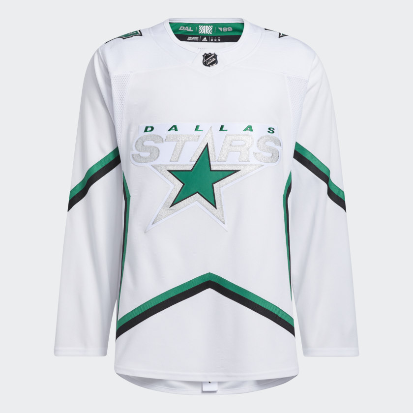
A controversial pick, I know. Fans either love or hate this jersey, and even I was on the fence about it for a while. It’s so basic. It’s so simple. It’s so bland. And maybe those are the best things about it. Jerseys can be so visually overwhelming (see previous) and it’s refreshing to have a jersey that’s a little more understated, and dare I say … wearable? The “star-poncho” jersey is easily one of Dallas’ best to choose from and fans were clamoring for its return. There’s a wealth of green jerseys in the NHL and not enough white ones, so a departure from their typical kelly-green hue makes for a one-of-a-kind look. There are a few key features on this jersey that really stand out. For one, the use of silver metallic thread. It’s shiny, it’s exciting, and it pops off the white background better than expected. The other fun detail is the star pattern that encompasses the whole jersey, back to front. Design details that create lines around the body are so much more appealing to the eye than a design that just sits in the middle of the jersey. The design is drawn from their 1999 Stanley Cup-winning team, and honestly, this jersey is a winner for the everyday, casual Stars fan.
3: The Arizona Coyotes
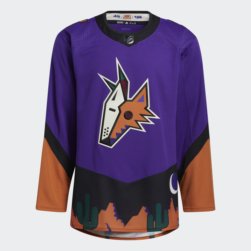
We’ve got a color swap! The Coyotes’ “Peyote Coyote” 1999 inspired jersey switches the green for purple in their desert scene jersey. Just look at that Kachina! And the lizard shoulder patch! This jersey is emblematic of everything I love about the reverse retro collection — the nostalgia factor. I’ve spent a lot of time in Arizona, and this jersey reminds me of some of my best memories there. The lizard’s boxy design and jagged center stripe exemplify local designs, and the orange foothill mountains, saguaros, and the Kachina and Sonoran desert imagery all make for a jersey that is decidedly Arizona. Plus, the dusky purple and sandy orange base colors mixed with the black, dark green, and burgundy accent colors are bright and fun. Vaguely 90s, this jersey is perfectly paired with jauntily cuffed jeans, fun socks, and a pretentious hand-knitted beanie. i.e. It wouldn’t look out of place in the halls of SAIC.
4: The New York Rangers
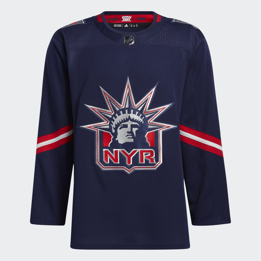
She’s back! Lady Liberty fans, the 1996 iconic logo is back again, 24 years after her first appearance. Is this the most creative design? No. Do I wear exciting designs? Also no. I’m boring. I like boring jerseys. This retro reverse jersey really leans into the retro — the Adidas team kept the Lady Liberty jersey relatively close to the original, and I’m glad they did. I love the deep blue and the slightly tilted armband stripes, but it’s the logo that steals the show. Instead of sticking with just red, white, and blue, the logo is shadowed in a grey that shows up in the shadow-dropped numbers, too. It not only creates great depth for the image that translates from afar (remember — the logo needs to be legible from the ice) but it also makes for a cohesive look. I just love the repetition of triangles throughout the stitching too. If I were to make one tiny change, it would be for white to be included more throughout the design, maybe as the drop-shadow for the names on the back. Regardless, the tiny details and overall structured simplicity of the design makes this an incredible jersey. I almost wish I was a Rangers fan. (Just kidding.)
5: The Carolina Hurricanes
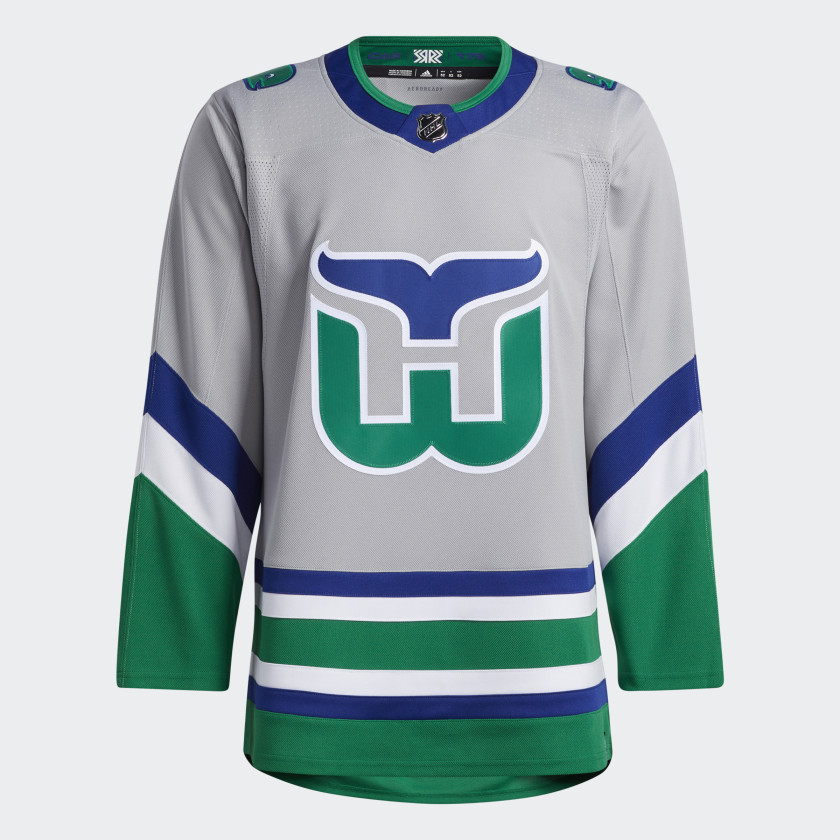
Sorry, have we suddenly time-traveled back to the era of the Hartford Whalers, the precursor team to the Carolina Hurricanes? This is a true throwback to the 1979 inaugural jersey, complete with a “Pucky the Whale” patch on the shoulder. This is the first time that the base color for the Carolina Hurricanes neé Hartford Whalers has been grey, and I … I love it. The grey background not only meshes well with the vibrant blue and green accents, but it makes the white outlining around the logo and numbers pop. This jersey really encapsulates the 70s, the wildest time in professional hockey, in the design through the clean, diagonal lines on the sleeves and the simple two-toned numbers. The Hurricanes have one of the most iconic retro logo designs with this jersey and the minimalist approach really lets the history of the logo and color scheme stay at the forefront. Does it remind me a little bit of the NWHL’s Connecticut Whale jerseys? Totally. But there’s always room for a true “reverse retro” like this one.
Honorable Mention: The Anaheim Ducks
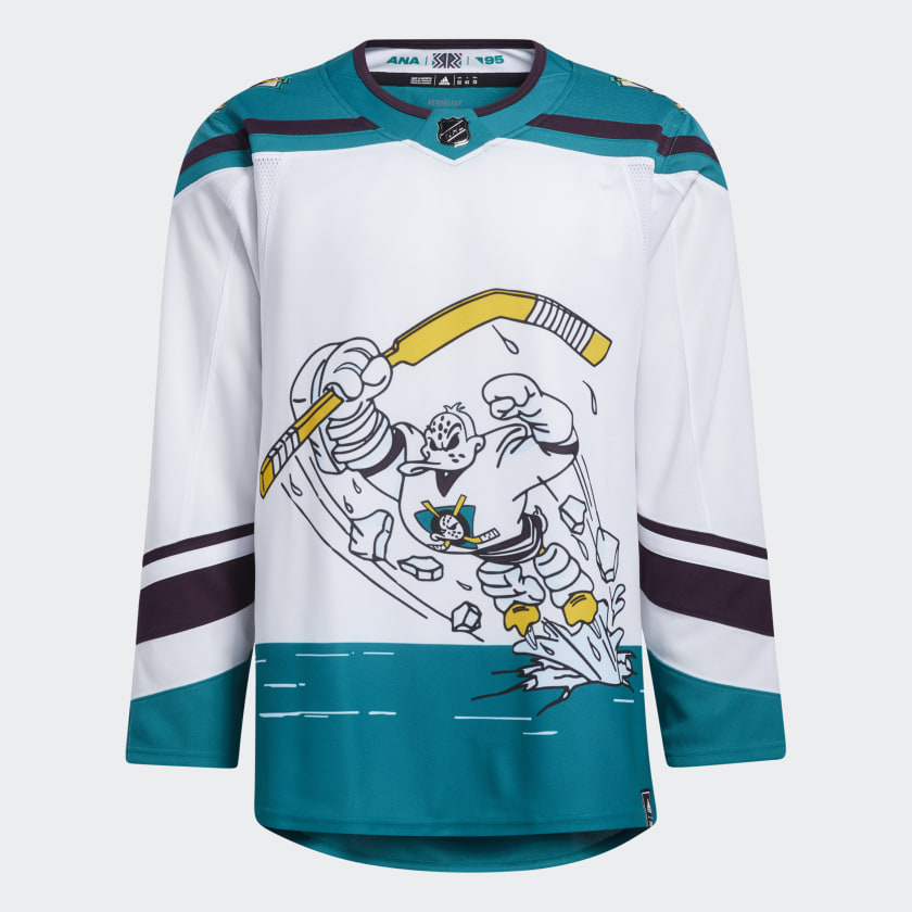
1995 is calling, and they want Wild Wing back. The only mascot to ever grace a jersey (and in goalie gear no less) Wild Wing is making a comeback on the Ducks’ sweaters. I’m partial to a teal jersey (hello, San Jose Sharks) and Anaheim doesn’t disappoint. The teal, black, and white color palette looks like it stepped right out of a 90s sitcom, along with the sweeping font. However, despite the nostalgic AF color scheme, the logo is the star of the show, here. Wild Wing is dressed in his goalie gear breaking right out of the ice. The Ducks’ logo is different from the other reverse retro jerseys because it’s a full setting, rather than just a symbol. (The ice is also the bottom stripe, which links with the diagonal stripe on the cuff of the sleeves.) Plus, the shoulder-pad-esque teal and black collar details just scream the 90s. Do I love this out of a misplaced sense of nostalgia? Do I hate this because it’s objectively a whack jersey and it lowkey looks like a coloring book page? These are the questions keeping me up at night.


