SAIC Renovates Flaxman Library
Since the Flaxman Library opened in 1989, it has tremendously expanded its resources to support research and leisure at SAIC. There is now a digital catalog with a growing collection of online articles, thousands of circulating books, and audiovisual material that includes DVDs, CDs, and even 16mm film. Many of these topics are outside the subject of art as well. But despite the important presence Flaxman has at SAIC, there were still a few problems with the visitor’s experience inside the library.
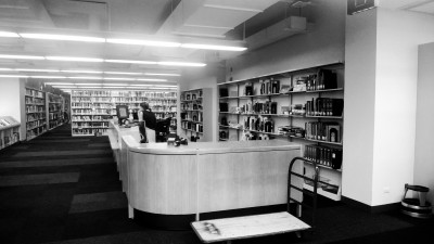
The main problem was the appearance of the library interior. There is a whole wall of large windows, but the bookshelves blocked incoming light. Hence dimly lit aisles lined by the old, dusty carpet greeted you on the way in. The confusing organization of the shelves made it difficult to locate your desired book, as you find that the photography section wrapped down and around a corner instead of in consecutive rows. The DVDs and CDs were split in separate sections, and there were a limited number of outlets and plugin stations for frequent laptop users. In order to improve the visitor experience and eliminate these inconveniences, the Flaxman Library underwent a renovation this summer that changed the physical and visual layout to create a new, redesigned library space.
For this renovation, SAIC decided to work with Wheeler Kearns Architects (WKA), a firm based in the Loop just a few blocks south of the school. Ron Kirkpatrick, Executive Director of Design and Construction at SAIC, was very satisfied with the collaboration, praising the “focused, quick decisions” made to ensure success and fluidity of the project. One of the reasons SAIC chose to work with WKA was that they immediately addressed a major internal concern — rotating the bookshelves to open a view of the windows. The shelves were originally running east to west, parallel to the windows, blocking light; and the new plan placed them north to south.

According to Flaxman Director Claire Eike, the library was regularly getting complaints about the layouts of the stacks. There were recurring suggestions from the students to rotate the stacks. Additionally, some old walls were demolished so offices and rooms could be shuffled around to make to create more room for the arranged stacks.
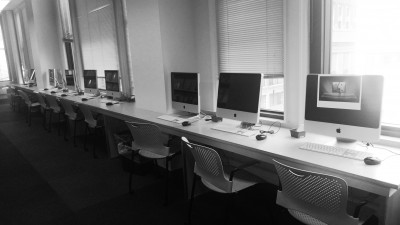
The individual study desks that were previously up against the windows were removed to also help filter more sunlight. To replace the old study lineup, WKA incorporated new study niches by having “the end of the stacks…staggered, creating intermittent semi-private places for study areas,” as written in their project proposal. These areas now sport newly designed furniture specifically made for use in the remodeled library.
Speed was essential for the Flaxman project. It was important the library would not have to be closed for long, a potential inconvenience for students and faculty. To meet this goal, most of construction took place during the two weeks between graduation and the start of the summer semester, which resulted in Flaxman closing down for only one week during summer school session. In the end, the whole library was demolished, constructed, and renovated in just three weeks.
Along with speed, budget was another important element in the Flaxman renovation. Kirkpatrick and SAIC Provost Elissa Tenny stressed that the renovation be completed as a low budget project not only for money’s sake, but also in an effort to push “the idea of sustainability.” As an art school that tends to lavishly use limited and sometimes harmful materials, it was important to try to reuse, recycle and modify equipment wherever possible.
There were some necessary upgrades such as increasing electrical outlets and offering more plugin stations with Ethernet cables to keep up with technological advances, as well as replacing the dusty carpet that has been on the floor since 1989. Otherwise, most of the bookshelves were reused, as well as the TVs and computers. One of the techniques to cut budget costs was what WKA called “skinning,” in which surfaces are re-finished with a vinyl film, which results in a new, polished look without having to replace any of the existing components. This skinning technique was used for the light fixtures in the library, which were otherwise mostly left untouched.
The title of the Flaxman project proposal by WKA was “Move It, Skin It, Stretch It,” and the renovation did just that. The shelves were moved to a different orientation, the lights skinned, and the library was in a sense stretched to take advantage of everything within the space. As a result, the library offers a more comprehensible system that incorporates the stacked books, DVDs, and digital media catalogue into one interdisciplinary space. As Eike said, “We can ease quietly back into the semester,” now that Flaxman has a fresh, bright and inviting environment that will guarantee a better experience for students, staff and faculty at SAIC. There is talk of additional projects for the library as well, so keep your eyes open for more improvements. And don’t forget to check out that bright green wall as you leave.


