No disrespect to the new interest in print publications, but there are also beautiful things happening with online journals, particularly in terms of interface and functionality. I had all but given up trying to deal with the excruciating “page flip” animation of scribd and other similar formats, but the elegant and intuitive layout of new short-form quarterly Edits, from Portland-based designer Ian Coyle, may have changed my mind.
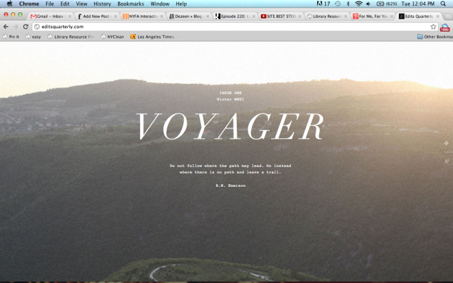
This week: Edits quarterly, issue no. 1, Winter 2012, Voyager
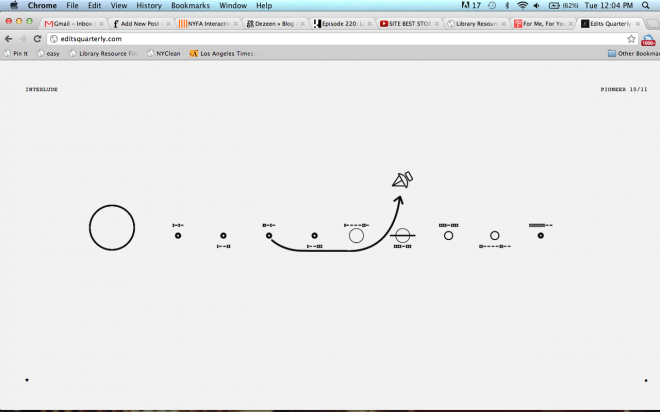
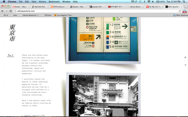
The vibe: Sun-speckled mountaintops and highways, analog photos in digital form (complete with shadowed frames), lots of Bodoni italic, and sweet “interlude” illustrations based on on navigation route maps
Not so much a magazine as a series of like-minded photo journals, vignettes gathered around short personal anecdotes from contributors on the theme of that issue’s title. The first iteration, Voyager, follows contributors from small towns in the Pacific Northwest to unspecified Japanese metropoli. Detailed travel accounts are not the goal here, so much as general vibes (or specters, more sophisticatedly) of place and memory colliding in the photographic image. Naturally, then, if location (and even author) are secondary, the camera model itself is the crucial contributor, and prominently displayed.
Travel as a mode of personal exploration is the overarching message, and the included content speaks not so much to vagabond abandon but to recurrent loops of habitual behavior: trips always seem to be trips home, trips back or trips away, rather than voyages unto themselves. Maybe it’s through this lens of reconsideration (contributors all seem to be sharing trips that are several years past) that we discover larger patterns in our voyage’s trajectory.
Now, where am I going this summer…?


