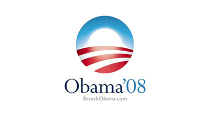
Sol Sender, leader of creative development for the Obama ’08 campaign logo, discusses his creative process
Interview by Caitlin Shriner
 Sol Sender shaped a new look for political campaigns when he designed President Obama’s campaign logo, but he took an unconventional path to design stardom. He graduated from Bowdoin College in 1992 with a major in religion and a minor in studio arts. He began his design education while working at Kinko’s in the computer services and publishing department, and after tooling around wtih the design programs and finding inspiration from a fellow employee, he entered the SAIC Post-baccalaureate program. He went on to receive an MFA in Visual Communications in 1999.
F NEWSMAGAZINE: What were your initial thoughts when you were approached by the Obama campaign?
SOL SENDER: Steve Jurris, also an SAIC grad, contacted me about the project. It was almost Christmas so I had to figure out how the team would be structured to work on it because everyone was battering for holidays. I made sure everyone was going to be available. I read both of the books that Obama had written to get a better sense of what ideas we might develop for the mark.
The idea for the new day was something that was mentioned early on, although we didn’t take it literally immediately. Hope was central to the theme of the book, and there was a lot about not being a red state or a blue state, and a unification theme that ran through his most recent book, “The Audacity of Hope.” Those were the kind of themes we picked up on and explored.
We wondered about the formal relationship between “OB” and “’08”. Turned out that was not a great avenue, because it didn’t really celebrate story. The investigations that we did on hope and unification and this idea of new day in American politics, those ended up being the most fruitful and interesting areas to explore.We had a ton of options in the beginning, whittled those down and showed the campaign eight or nine. They were really pleased with presentation and wanted to move forward so we did more development around them and thought they might be used. Then they narrowed it down to two options.
We recommended the one that was chosen. It was quite innovative as a portable mark because generally there hadn’t been logos, but it was also one of the more conservative options because it used red, white, and blue. I was clear in my opinion that it was going to be an important component and that we didn’t go too far out of the box that it didn’t have a traditional patriotic foundation. We wanted to reinforce the connection of experience and patriotism. He is sort of representing the American dream in many ways that worked out well.
F: The development of a mark veered drastically from prior political campaign work. What influenced that move? Were there any political graphic contexts that were influential?
SS: We did some research as far as American political graphics in presidential campaigns, but the more we looked, the more we realized that there wasn’t a lot to admire. I think that our work and our ideas came from a more corporate and commercial branding space developing marks and logotypes for more traditional brands.
With the mark that was chosen, we felt that it would be great if it could be used independently of the candidate’s name. It could get to point that if someone was wearing a tiepin and they wouldn’t have to have anything except for that mark to identify themselves as an Obama supporter. I think that was a very important component of our feelings about that particular mark. There wasn’t a whole lot of direct marketing, and we were not inspired at all by political graphics of the past. There wasn’t anything we could find to be inspired by.
F: Coming from working on a political campaign, what is your opinion on the role of the designer today socially/politically/environmentally? Do you believe that there will be an important role for designers in the future?
SS: We were so buried in the project, and it happened so quickly we didn’t have much time to think about the designers’ role. We were so flattered and excited to be a part of it. Obviously, I had done some thinking prior to the work, and have done some thinking since. I think that communications plays an important role in the society. When you look at areas designers can impact and play a certain role. For the past decade the AIGA has been focusing on ballot reform and designing ballots as clearly as possible.
Design in the broader sense is a way of thinking and looking for quality and logic. Looking for design principles and principles of clear and simple expression and interface elegance are some problems that we face today. I am not sure that many designers have tapped into that.
As things migrate to the Web, interface becomes our central experience to people’s lives. Not only how they get entertainment, read, or get news, but how they manage their finances and ultimately how they will manage their health care. Interface is going to increase in importance and obviously designers have a very strong role to play as far as the quality of experience which can make a significant difference in quality of peoples lives.
F: How do you think that the Obama campaign will influence future campaigns?
SS: I think it certainly impacted McCain’s campaign. They were trying to keep up with the Obama campaign with use of social media and other design tactics, but always a number of steps behind. There are a lot of people doing decent work coming from the Republicans’ admiration for what Obama did and much can be learned from that. We’ve seen logos springing forth in smaller campaigns since Obama was elected.
One of the areas in which he has been attacked is the slickness and over-packaging. I’m curious how that will play out in 2012.
My guess would be that we will see more logos. There has been a new bar set, beyond the logo. We handed off the logo to the campaign pretty early, and they did such a magnificent job building out the website and building out a whole language around the logo and their use of typography and the consistency in design language. They certainly set the bar quite high, and people are going to aspire to that and realize there is a new level to rise to when you are running a successful campaign.
F: Both you and another SAIC alum Perry Sheppard played strong roles in the 2008 campaign. Do you think that this speaks about the school?
SS: I think that the school, at least while I was there, has a strong social consciousness and looks for cultural intersections. The professors in the Visual Communications Department do work that is political. Ann Tyler does great book work around political issues. BJ Krivanek does great community work that involves installations and works with communities to tell their stories. Steven Farrell is interested in those types of issues as well.
I probably wet pretty far down a commercial rout, maybe further down than I expected, but a lot of SAIC graduates end up in the business world. One of the partners at VSA is an SAIC grad another associate partner is, we have 3 or 4 people there, even one from art and tech. I was happy with the time there and look back on it fondly and am happy to come by now and then. I taught some classes in past years, and hope to again in the future.


