These twelve badasses revolutionized graphic design. Protecting the public from mundane magazine spreads, boring book covers, and no-fun front pages, these artists brought innovation to graphic design in the fields of photomontage, logo design, illustration, and typography. Oh, and each individual profile below was designed by a first-time designer, an amateur — a hero-in-training, if you will.
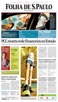 MARIO GARCIA
The Daddy Warbucks of Design
WHY HE MATTERS: Garcia designs for print, online, and even mobile devices but he’s most famous as the king of newspaper redesign.
NOTABLE CLIENTS: The Wall Street Journal, the San Francisco Examiner, the Miami Herald and close to 500 other papers around the world.
HOW HE WORKS: When redesigning newspapers, he doesn’t just think about visual redesign but content as well as saying, “A redesign is like plastic surgery. It can change your nose, but not your personality.”
PARTING SHOT: Where does he see the future of newspapers? Tabloid design and more celebrity/fashion/trend pieces.
—WHITNEY STOEPEL
 JANET FROELICH
The Handsome One
MANY HATS: A designer, an art director, a self-proclaimed “visual journalist,” and an altogether handsome woman.
RESUME: Former creative director for The New York Times Magazine, current creative director for Real Simple.
GOLD STARS: Froelich has won more than 60 gold and silver awards for her bold art direction and she was inducted into the Art Directors Hall of Fame in 2006.
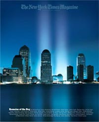
FAMOUS IMAGE: She designed the 9/11 cover for the Times Magazine, which showed beams of light rising from Ground Zero where the towers once stood.
—ANNA WOLAK
 RODRIGO SANCHEZ
The Transformer
SUPER STRENGTHS: Art director. Graphic designer. Journalist.
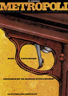
HERO’S RESUME: Sanchez is the art director of the newspaper El Mundo and its supplements — Metropoli and La Revista. He uses typographic solutions instead of photography, challenging other designers to rise to the level of his creativity.
HIDEAWAY BUNK: This famous graphic designer flexes his design muscles in Madrid, Spain.
MOTTO: “Design has a lot to do with personality change and life itself. But life is unpredictable.”
—HEATHER LIGGINS
 DAVID CARSON
The Father of Grunge?
WHO: A publication designer who is also responsible for a line of surf apparel by Quicksilver.
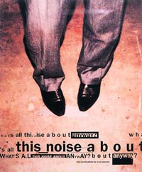
WHAT: Carson was the art director of Transworld Skateboarding magazine prior to taking over the design of Ray Gun magazine.
WHERE: SoCal was the base for both of the magazines that Carson worked with, although he owns studios on both coasts.
HEROICS: Used dingbat font exclusively for a Bryan Ferry interview.
IMPRESSIVE: “The End of Print: The Graphic Design of David Carson” is the best-selling book on design ever released.
—DAVE CANTOR
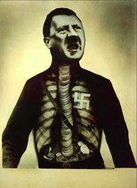 JOHN HEARTFIELD
The Anti-Anti-Semite
WHO: John Heartfield was a German artist who specialized in photomontage. He was a member of the Berlin Dada group and the Communist Party of Germany.
WHAT: He is most widely known for the covers he designed for Die Arbeiter Illustrierte Zeitung (Workers’ Illustrated Magazine or AIZ).
WHY: Heartfield was unafraid to use his art to make strong political commentary. One of his famous covers for AIZ is Adolf the Superman, a photo of Hitler overlaid with an X-ray that shows him swallowing coins. The caption reads, “Adolf the Superman, Swallows Gold and Spouts Tin.” It was a criticism of Hitler’s financial backing by wealthy German Industrialists in spite of his promotion of socialism.
—NICOLE NELSON
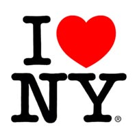 MILTON GLASER
Most likely to be better than you
WHY YOU SHOULD CARE: Founded New York Magazine and the “I (heart) New York” logo which found its way onto every t-shirt and coffee mug in America. Also designed his stencil, the “glaser stencil”, because he kicks ass.
THE GLASER DESIGN FOR LIFE: “Style is not to be trusted. Some people are toxic, avoid them.” Design should be ethical and the designer bold, model and dignified. Don’t work for money…cause you probably won’t make any. Let your design be your reward.
—CHRIS TURPIN
WHO HE IS: Corporate logo designer
WHAT HE’S DONE: Created company branding and logos for UPS, IBM and, infamously, Enron.
WHERE HE WORKED: Apparel Arts Magazine, Esquire/Coronet
WHY HE’S A HERO: Rand is the alpha and omega of modernist corporate design
WHEN: Created his most famous works in the 1950s and 60s, lived 1914-1996.
FUN FACT: Rand resigned as a professor from Yale University in 1992 after the hiring of a controversial, anti-modernist designer.
—NICKI YOWELL
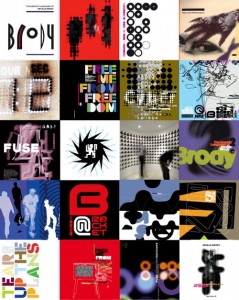 NEVILLE BRODY
The Design Anarchist
WHO: Graphic designer, art director, typographer, founded The Studio in London, head of Research Studios.
CLIENTS: Fetish Magazine, FontWorks, The Face, Arena, Fuse, Issey Miyake, Adidas-Salomon, British Airways, Macromedia, Armani, Nike, Sony, The Dutch National Post Office, and BBC
Why HE’S A HERO: He designed a number of typefaces that are visible in everything from advertising to rock biographies, fashion magazines, album and magazine covers. By incorporating and combining typefaces, he created an opening for digital type design.
FUN FACT: He was almost thrown out of college for putting the Queen of England’s head sideways on a postage stamp.
—CAROLINE O. LIEBMAN
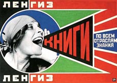 ALEXANDER RODCHENKO
Captain of Constructivism
WHO: Rodchenko was an artist, photographer, and designer working in the 1910s and 1920s, before, during and after the Russian Revolution. His graphic work involves photomontage, a primary palate, sharp diagonals, geometric shapes, and bold typefaces.
WHY: He worked only for social change and reform and designed book covers, union posters, and covers of the leftist art journal, LEF. He was the face of Russian avant-garde and one of the most important pioneers of modern graphic design. His bold, progressive style continues to be an inspiration to artists and designers today.
HEROICS: He rejected the term “art” as bourgeois and channeled his passion into producing socially useful creations.
—MIA DIMEO
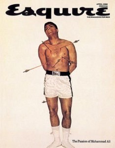 GEORGE LOIS
Magazine designer extraordinaire
WHO: An American art director as well as a prolific advertising manager.
CLIENTS: Esquire Magazine, Xerox, VH1, MTV, Lean Cuisine, Tommy Hilfiger, Jiffy Lube, USA Today, Herald Tribune.
WHY: Famous primarily for his impact on magazine design with his extensive series of covers for Esquire Magazine, Lois’s ’92 covers were recently featured in a retrospective at MoMA. Lois’s covers, which often inspired controversy, are now looked upon as visual icons of the 1960s, forcing Americans to confront such controversial issues as racism, feminism, and the Vietnam War. He is also known for popularizing Xerox culture, beginning VH1 and running the “I Want My MTV” campaign.
—AMANDA ALDINGER
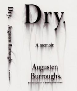
WHO: Chip Kidd is a book cover designer based in Manhattan. He studied at Penn State where he mocked up book covers for John Updike, who he would later do actual covers for.
WHAT: Updike writes about Kidd: “Can he draw? Presumably, yet the mark of his pen or pencil rarely figures into his work. His tool is the digital computer, with its ever more ingenious graphics programs. In the ever-expanding electronic archives of scannable photographic imagery, he is a hunter-gatherer.”
HOW MANY: Kidd has turned out jacket designs at an average of 75 a year, and is currently art director at Knopf Publishing, a division of Random House.
—TALEEN KALENDARIAN
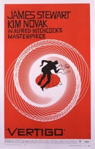
WHO: Saul Bass played an unusually glamorous role working in film. One can tell the plot and outcome of a movie by carefully watching the design of his opening credits.
WORKED FOR: Alfred Hitchcock, Otto Preminger, Stanley Kubrick, and Martin Scorsese.
WHY HE’S A HERO: When Otto Preminger’s film, “The Man with the Golden Arm” first arrived in theaters, projectionists were instructed to pull the curtain back before the opening credits. Before this time, the opening credits had never been shown because they were infamously dull. Saul Bass changed that.
WHEN: The 1950s and 60s
FUN FACT: Also designed the AT&T Bell logo.
—BRITANY ROBINSON




[…] Design Heroes […]
[…] here’s our M.A. program’s contribution to the design edition of F News. These are Mike Miner’s […]