Matthew Carter speaks about Verdana, Ikea’s new type identity
by Bethany Armstrong
 “It’s true. IKEA abandons ~50 years of Futura and Century Schoolbook for… Verdana.” On August 21st Typophile.com, a popular typography and design blog, opened a discussion board with this controversial news for the type and graphic design communities. Most who commented were in agreement; fonts made for the monitor should stay on the monitor.
According to Typophile member Raumschiff, “…the reason for the change is to be able to use the same font i[n all countries, including [A]sian countries… they want to be able to give the same visual impression both in print and the web.”
Companies want their online presence to represent their print identity as closely as possible in order to retain brand identity. Screen fonts are chosen to reflect the typeface used by the company as part of their internal and external style guide. Companies choose a ‘web font’ that is universally available on most computers (cross-platform), but this is not usually the same typeface they use for print advertisements, or even for interactive media, it is only to accompany their standard typefaces for code-generated body-copy and headlines.
Ikea chose to go with a free and widely distributed font, instead of hiring a typographer to create a new typeface, and claim to be passing the savings on to their customers. “It’s more efficient and cost-effective,” said Ikea spokeswoman Monika Gocic, according to Time. “Plus, it’s a simple, modern-looking typeface.”
Dr. Matthew Carter designed and developed Verdana in 1996 as part of a project by Microsoft to develop the best screen type faces, ‘fonts,’ for the computer monitor, providing optimum readability. Dr. Carter is a type designer who, before working for Microsoft, designed type the old-fashioned way: cutting punches from steel for metal type. A designer with fifty years of experience, Matthew mastered lead type before perfecting bitmaps and vector drawing.
BA When you designed Verdana, you did so coming from a solid print type design background. How was it made?
MC The purpose of designing Verdana and Georgia was to make two typeface families that were as legible as possible at text sizes on computer screens. It was obvious from the start, however, that they would also be used at display sizes on screen and at every size in print. With this in mind I tried to give the designs a visual style that went beyond the generic functionality of screen bitmaps.
BA What are your thoughts on using screen fonts for print?
MC I have been told by designers and design students that Verdana and Georgia must never be used on paper because they are “screen fonts” and that printing them is “bad design.” But when I ask “What’s the difference? What is it about Verdana on paper that tells you it was designed for the screen?” they can’t answer. They are parroting an opinion they have heard without understanding it.
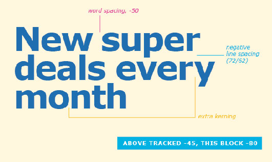
I would never insist on using Verdana for print, but I would NEVER tell a student NEVER to use it—or any other typeface. What I would say is that Verdana may require more adjustment in print than some other typefaces. Depending on the size(s) at which the type is set it may be desirable to tighten the tracking, watch the kerning, and so on. But these are things a student should be taught.
Many in the type community have been working for more than a decade to make it possible for all typefaces to be available on screen, eliminating the need for substitution, but the problems lie in developing easy to-use software capable to emulate or distribute type, as well as licensing the type for fair use. It was only a matter of time before a big brand, like Ikea, decided to work this issue from the other way around— fine tune a screen font as a printable and print-worthy typeface.
That’s exactly what is happening here; the screen version of Verdana has been finely ‘set’ by the designers of Ikea, tracking and kerning the characters for print. When my Ikea catalog arrived I must admit, the type design was wonderful and clear with good hierarchy. I noted the new distinctive humanist typeface—I wondered what typeface it was.
MC There’s a remark close to the heart of type-designers that I’ve heard attributed to Alvin Lustig while he was teaching at Yale: “There are no good typefaces or bad typefaces: there are typefaces you know how to use and typefaces you don’t know how to use.”


