

Ryan Hageman, as he puts it, “investigates communication at the intersections of language and culture” through designing in both Japanese and English. Gurafiku (Japanese for “graphic”), his website and research project dedicated to collecting examples of Japanese graphic design history including posters, prints, book covers, advertisements and flyers spanning the 1800s to today, aims to remove the linguistic barriers that keep international audiences from a rich vein of visual culture. He recently delivered a presentation lecture at the Tokyo Type Directors Club Exhibition in Saint Paul, Minnesota, connecting the juried works in the show and the greater canon of Japanese design.
Hageman received his BFA in Graphic Design from the Minneapolis College of Art and Design (MCAD) in 2011 and then interned with the Walker Art Center. He works as a graphic designer at the Art Institute of Chicago, where he primarily creates exhibition posters and materials. In addition, he is pursuing graduate studies in Arts Administration and Policy at the School of the Art Institute of Chicago.
You’re originally from the Chicago area. How did you become interested in Japan?
Through studying graphic design. In design history courses, I was really interested in modernist design and the Bauhaus theorists, but our studies were always limited to America or Western Europe; there was hardly ever any mention of Asia. I eventually came across the work of Yusaku Kamakura and Ikko Tanaka, who are two very well known Japanese graphic designers. They completely inspired me because I found what they were doing to be warm, colorful, and playful. I wanted to learn more about those two, and then I started to find other Japanese designers.
You also had the opportunity to study design in Japan in 2010, which sounds like it was a dream experience for that emerging interest.
Right. MCAD has an exchange program with Sozosha College of Design in Osaka, so I spent a semester there studying design in Japanese after taking some language classes. I had to give little presentations, but my vocabulary was so rudimentary: “This is my work. This is simple. This is a sans-serif typeface.” It was a small school that didn’t have much of an international program, so I was immersed and that forced me to learn the language.
Did Gurafiku grow out of that experience?
I started it beforehand in order to prepare for studying there. Whenever I’m interested in something, I’ll make a blog about it. I’ve had probably fifteen different blogs over the years! Gurafiku is the only one that has lasted. One of the reasons I started it was because historical examples of Japanese design are so difficult to find. Lately it’s been primarily focused on contemporary work, mostly because that is what is readily available.
In that sense, Gurafiku is a way to study Japanese language and culture through a design lens.
It’s an excuse for me to learn more Japanese. The more language I learn, the more design I can find and it becomes easier to identify designers and all of the characteristics of these works.
How has Gurafiku, and by extension, your fascinations with Japanese design history, translated into your own work as a designer?
The part I enjoy the most about Gurafiku is all of the research that goes into it. In general, whenever I start a project I always try to have a deep understanding of the context and history involved. The research informs my choice of typeface, visual style, format, and way the project is interacted with. My goal is to always do what’s most appropriate for the project at hand, resulting in something very natural, with clarity and sound logic. Because I enjoy that research component, I try as much as I can to take on work that lets me explore different languages, culture, and history. At a technical level, learning to design in Japanese has definitely had an influence on my typographic sensibilities and my understanding of composition. Working with an entirely different set of characters within a system that traditionally reads in the opposite direction [compared to English] has really made me consider other ways of looking and the way people perceive information.
How do you incorporate those different “ways of looking”?
While in Japan, I made a poster for the movie Lost in Translation as part of a class assignment. Using both Japanese and English, I transposed the lines of type over one another, manually curving the letterforms to make the two languages blend together. In certain areas the Japanese text would become most prominent, and as those characters fade away, the English text would then come to the foreground. For those with an understanding of both languages, the text could be perceived simultaneously to complete the full message. If not, the design encourages the viewer to make inferences based on the elements they’re able to put together.
How did you decide on the name “Gurafiku,” which is the Romanization of the Japanese word for “graphic”?
Honestly, I just came up with a long list of name ideas, and that one stuck out. It obviously works for the situation, but the word is actually a misspelling of the transliteration; there really should be two “k’s” to make it “Gurafikku.” I dropped the one “k” just to make things simpler, because it feels awkward to see and type, but then I also realized that it’s weird for English speakers to say “gurafiku” since we’re used to seeing “gra-“ instead of “gura-.” I thought about switching the name to “Grafiku,” but at this point it would be difficult because so many people are familiar with and follow the project now.
Either way, it’s a strong name, and if you’re familiar with Japan you get the concept behind what you’re doing right away.
There’s also the icon for the site [the hiragana symbol for the syllable “no” within a red circle], which I actually designed for a different blog I kept up about learning Japanese. It kind of looks like the Wi-Fi symbol and has an Internet feel to it, and it also mimics the red circle in the center of the Japanese flag. Because that hiragana character is so round, it kind of looks like a globe, almost like the AT&T logo… but those are all subtexts.
Is it difficult to design in Japanese because of the need to accommodate the character forms?
The main difficulty is the inability to read Japanese if you’re not familiar with it. With English, you can understand the flow of text; if words get cut off and it doesn’t read right, you can make changes very easily. If you can’t read Japanese, you can still design around it but it doesn’t feel natural. The more you learn the language, the better your design will be.
A former art history instructor of mine used to claim that Chinese aesthetics are saturated while Japanese are subdued. That feels incredibly simplified.
People ask me to define Japanese graphic design, and I can only respond, “Well, it’s kind of difficult, and here’s a long explanation as to why.” It’s hard to narrow it down to one definitive characteristic because it’s just so diverse. I’ll look through everything I’ve collected and it’s all over the place. There’s one side that employs aspects of traditional crafts, minimal compositions and textures. Then there are really dynamic, maximal examples that have so much going on, and then everything in between.
Perhaps that’s reflective of talking about cultures in general.
That’s what keeps this work interesting.
What are some other examples of specific projects that show influences from your time in Japan?
Upon returning from Japan in 2011, I started a project exploring my experiences learning the language, day-to-day life, and my observations on the often imperfect nature of communication through the lens of a designer. I ended up creating animated visualizations to go along with a lecture I gave at the University of Minnesota called “Pera Pera,” about the challenges and opportunities presented by cross-cultural communication. For that talk, I began by introducing the unique aspects of Japanese language, then I covered how miscommunication forces us to improvise and think in new ways to make ourselves understood and better understand one another. I finished with the idea of language as a border that, in our current world, continues to divide while other borders have faded over time.
How do you source what goes on to the Gurafiku feed?
I have a Pinterest page where I collect all of the things that I find browsing online. If I find something I like I’ll “pin” it to there, and that becomes the pool that I choose from for the main feed. Pinterest makes it easy to keep everything I come across organized, and I also get some feedback in terms of what people are interested in through the forms of their “likes” and re-pins. There are some designs on there that I like but no one else really does, but I’ll use those anyway! If that’s the case, those examples usually have some kind of interesting value, like an experimental composition.
What designs are consistently popular on Gurafiku?
Those that incorporate Japanese text. Japanese designers use a combination of scripts; some only design using Roman characters, but for some reason those examples don’t seem as popular because they aren’t immediately identifiable as “Japanese.” That can be a shame, because those are often really interesting compositions, but they just aren’t quite as valued for some reason. I post a lot of posters, and I especially enjoy exhibition posters because their designs are usually pretty progressive.
And that’s what you work on at the Art Institute, right?
Yeah, that’s really what I enjoy doing! It’s always a good format and size to work with, and they always translate over well to websites.
How do you translate Japanese design into your projects for the Art Institute of Chicago?
The Art Institute has a nice collection of Japanese art and a few galleries dedicated specifically to traditional Japanese works and ukiyo-e [woodblock prints]. I usually get to work on the graphics for those projects and that gives me the opportunity to explore the more traditional aspects of Japanese aesthetics. In 2013, the museum held an exhibition on contemporary Japanese fashion called Material Translations. The show included the work of Issey Miyake, Junya Watanabe, and Rei Kawakubo, among others. I designed a publication to accompany the exhibition that was free for visitors to take with them. It included essays on Japanese fashion, along with images of all those beautiful garments. The text for the catalog was in both Japanese and English, and again, I explored the relationship between the two. I experimented with translucent paper stock, allowing the text to show through the different layers. I also called attention to the work of the designers by featuring detailed images of the garments on gatefold pages of glossy magazine paper. I tried to investigate texture and material through that publication, influenced by concepts as seen in the clothing.
Is there an era of Japanese design history that you particularly enjoy researching?
The 1950s and 1960s, because I like modernist design and it relates to my own work. I’m a fan of Tadanori Yokoo, who was popular in the 1960s and 1970s and is still designing today. His work is the total opposite of clean, minimal, and modernist; it’s really bright, kind of psychedelic with a lot of collage work. He did a lot of theater posters for avant-garde productions, and stuff for The Beatles. I appreciate him so much because I feel like no matter how hard I might try, I could never design like he does.

How do you want to expand Gurafiku beyond your research feed?
At the moment it’s pretty much a solo project, and I’d like to bring on more people. I’m interested in branching into publishing books, working with design historians, and expanding the English-language information on Japanese graphic design on Wikipedia, because there isn’t much there. I’d love to set up a web shop and import Japanese design books and magazines to give people closer access to those materials. I’d also want to start doing exhibitions, and my lofty aspiration is to set up some kind of permanent museum.
Outside of collecting, cataloging, and sharing all of your findings, what is your goal for this project in the long run?
It’s very important to me to show the work of Japanese designers practicing today, and something I see, as a successful result of all of this, would be elevating their careers on an international level. It would be great if designers there would be able to grow outside of Japan because someone saw their work on my website. I want to create opportunities for them to keep creating.
Do you have any recommendations for resources for those interested in learning more about Japanese graphic design history?
Visions of Japan is a book published in 1991 by the Victoria and Albert Museum and the Japan Foundation on the occasion of an exhibition of the same name. The book actually comes in three components, all housed in a hardback slipcase. One book contained text about the exhibition along with essays on Japanese culture and aesthetics. This was accompanied by a separate accordion-bound photo book of images contrasting Japan of the past and present (at the time of publication, that is). What makes this book a real gem is that it comes with a folder of 28 unbound pages that explore contemporary life in Japan through collaged compositions. The production value of them is phenomenal; they combine traditional offset printing with scraps of ephemera like train tickets, photographs, patterned origami paper, and the green plastic grass typically found in convenience store lunch boxes, all adhered to the pages by hand.
Idea Magazine is another Japanese publication I love. It’s been around since the 1950s, but it was given new life by Muroga Kiyonori in 2003. It touches on many aspects of graphic design, but its main focus is on the design of Japan. In terms of production, I feel like it is a model to which all magazines should aspire. Every issue is printed using numerous different paper stocks, gatefold pages, and even fluorescent and metallic spot colors when called for to make faithful reproductions. The content includes in-depth essays on the history of design along with features on the work of contemporary designers and the context in which they operate.


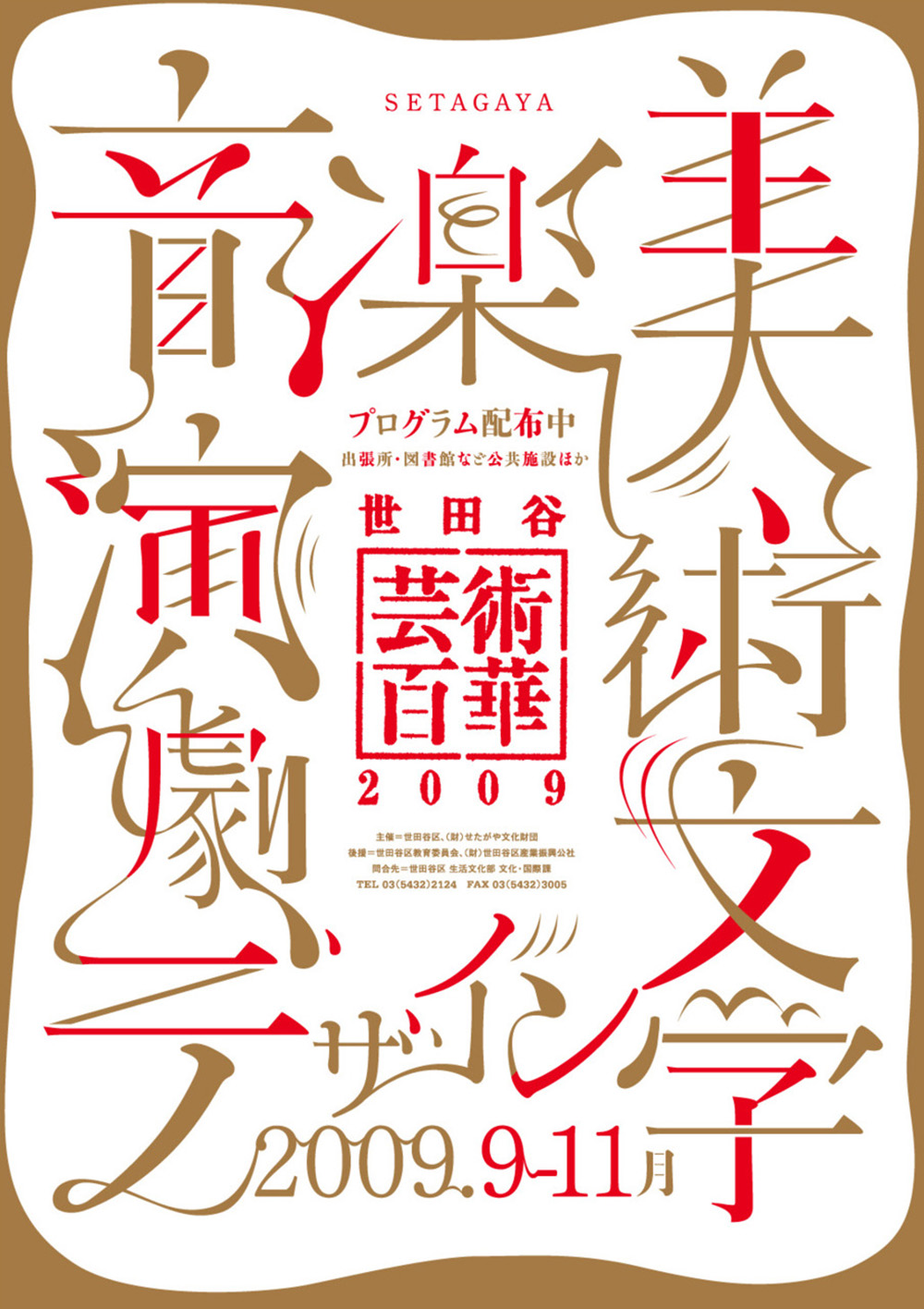
[…] takes a lot of work to create a Japanese typeface,” Ryan Hageman says, “and because of this there aren’t nearly as many off-the-shelf and expressive typefaces to […]
[…] takes a lot of work to create a Japanese typeface,” Ryan Hageman says, “and because of this there aren’t nearly as many off-the-shelf and expressive typefaces to […]