From round-the-clock breaking news coverage to a walk down the street, sometimes it feels like there is far more negativity than positivity in the world. We’re constantly on guard against crime, terror and violence, and other guises of hate seep into our day-to-day such as humiliating and pandering advertising or overhead snippets of verbally abusive conversations. Our own self-hate can even fuel our consumption to feed our insecurities.
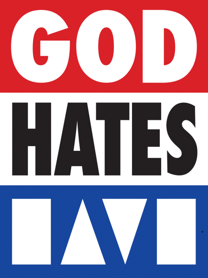
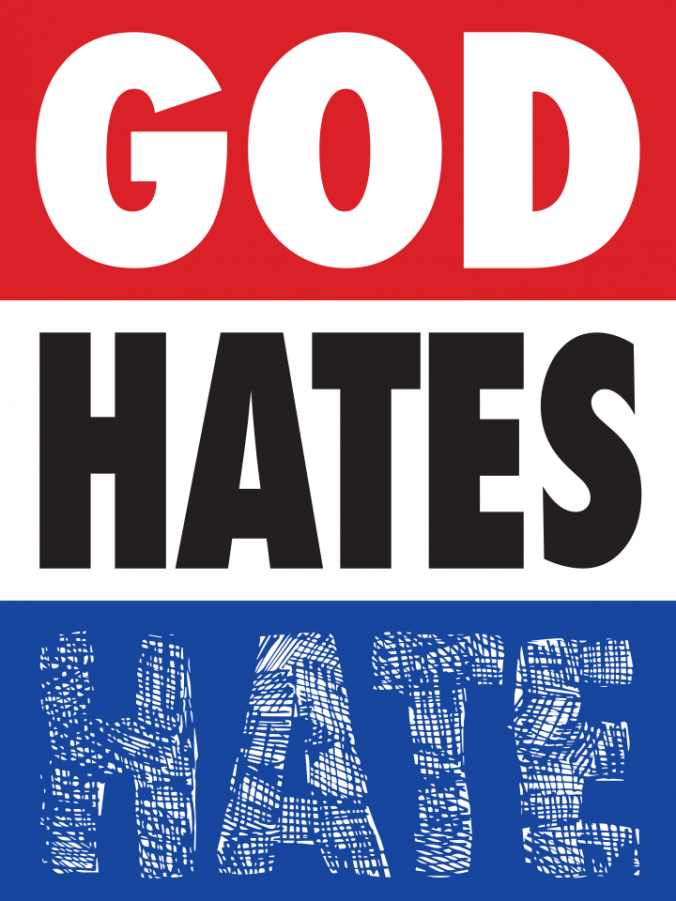
A project from Bud Rodecker and Nick Adam that has been building since 2010 and transformed into a new website this week proves that “hate” is not just another four letter word. HatesHate addresses negativity through imagery that mimics the infamous anti-gay picket signs encouraged by the controversial Westboro Baptist Church founder Fred Phelps, political campaign posters or other forms of searing propaganda. Through repetition in the form of collaboration with visual communicators, “hate” is reconditioned into a statement of hope for a kinder world. To quote the statement from the project page:
“Natural learning for people happens through repetition. Hearing something often enough without challenge can eventually become truth. Unchallenged negativity is a profoundly destructive force capable of ill-effecting moments, environments, and lives. HatesHate is a simple visual response to the root of all things negative in the world. It’s an effort in repetition to redirect hate-filled messages towards a more compassionate truth.”
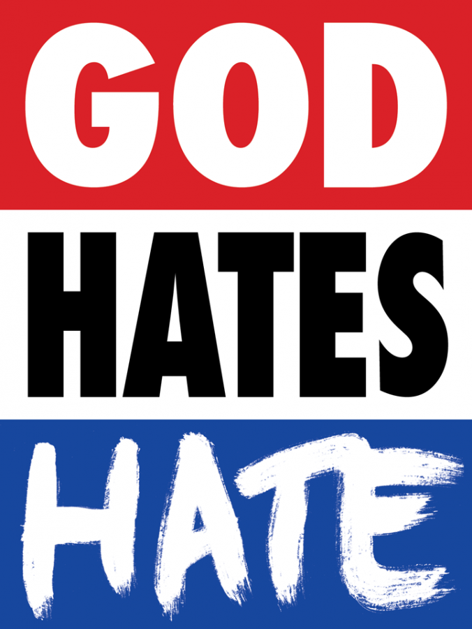
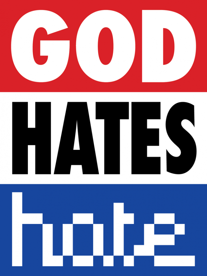
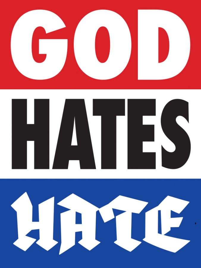
While aggressive and off-putting at first glance, the output ultimately stands as an initiative to reclaim and re-imagine “hate.” The effect is a visual call-and-response that randomly tiles with each refresh. The sheer repetitive re-imagining of “hate” takes away its inherent venom.
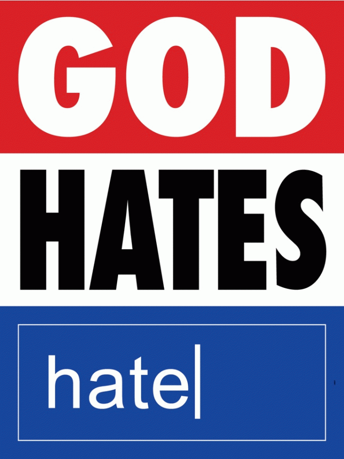
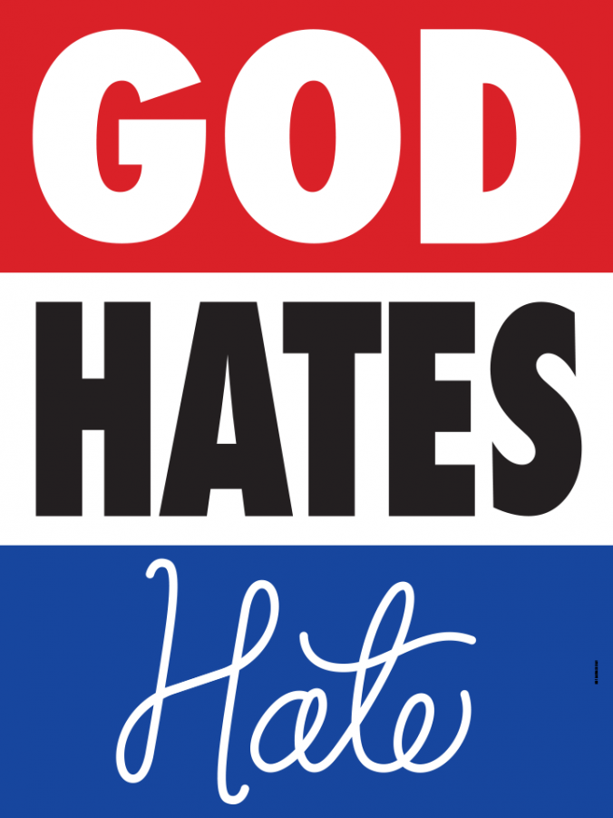
Communication designers are asked to fill an 18″ x 8″ space with their interpretation. Several present and former designers of F Newsmagazine have contributed to the project already, and the works just keep growing.
