Here’s how you know that you gave up your life in sports to study art: You’re watching Game 7 of the 2016 World Series, the Chicago Cubs are on the brink of ending a 108-year Championship drought, one of the Cubs Guys is up to bat, and you think: “THOSE gloves with THAT top??”
It is in this precise spirit that I will now rank all of the Chicago sports team’s logos from worst to best.
6) Blackhawks
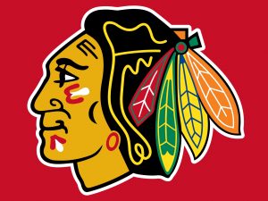
The Blackhawks are named after Black Hawk (b. 1737, d. 1838), leader of the Sauk tribe who led the fight against the United States in the War of 1812. You’d be forgiven for not knowing this because the Blackhawks logo looks absolutely nothing like Black Hawk.
To begin with, this logo is racist. But even putting aside the fact that it exploits indigenous people for the amusement of their genocidal colonizers, it’s ugly to look at. It’s difficult to know where to start with this drawing. First of all, the line weight is a mess. The thickness of the outline is nearly double the weight of “Black Hawk’s” nose and feathers, starting us off on our long tour of this logo’s stylistic inconsistencies.
HOW DO YOU WANT TO DRAW A FEATHER? PICK ONE WAY. This artist had four separate shots at drawing a feather and decided to take each one as an experiment.
WHAT IS THAT YELLOW SQUIGGLE? IT LOOKS LIKE MUSTARD.
WHY IS HIS EYE SO BIG? And why does he need it forcibly connected to his eyebrow?
WHY IS HIS MOUTH LIKE THAT? It’s practically Seussian.
WHY IS HIS EARRING ON HIS HAIR?
IS THAT A JAW BONE OR A FACE TAT? I can’t tell because this drawing is so bad.
And the colors are insane. But this might, oddly, be the logo’s one redeeming quality. Somehow, the absolute chaos of literally every color except purple combines for an almost pleasing autumnal quality.
5) Bulls
I grew up during the reign of Jordan, Pippen, and Rodman, and will always have a place in my heart for the Bulls because of this. Why is the team named the Bulls? Because, according to the team’s first owner, Richard Klein, Chicago was “the meat capital of the world.” So, go ahead and picture a slaughterhouse every time you look at this children’s clip art logo.
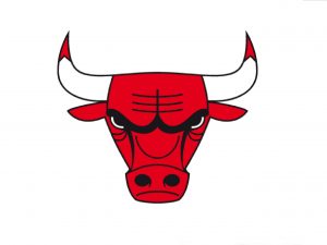
This bull does not look intimidating. It looks frustrated, like you accidentally spilled wine on its rug. Like you left the guacamole out all night. Like it had to take out the trash because you forgot again, Steve! That was your job! Look at the chore wheel!
Line weight is a problem here, too. Inconsistency isn’t the issue; it’s the weight itself. It’s noncommittal. It’s not thin enough or thick enough to read as a clear stylistic choice. It sits uncomfortably in a middle ground that says, “Someone paid me too little to whip this up before a committee meeting about optimizing employee integration.”
Why do its horns have dyed tips?
4) Fire
“What on Earth is the Chicago Fire,” you ask? They’re Chicago’s Major League Soccer team! I’ll spare all of you a diatribe about how soccer is underappreciated in this country and that now is actually a perfect time to get into it because the Fire, after finishing dead last this past season, are currently in second place due to the acquisition of World Cup winner Bastian Schweinsteiger — I’ll just get straight to the logo.
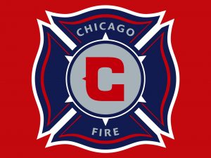
There are mixed messages here. First of all, we’re called the Chicago Fire, which is a bit like the “New Orleans Katrinas” or the “New York 9/11s.” Second, we’ve gone with a fire station motif, so are we putting the fire out? Are we the fire? Are we firefighters? Our mascot is a Dalmatian, to confuse things beyond comprehension.
The logo itself, however, is quite nice. I could do without the gray. Red, white, and blue would have been just fine. The whole thing is a bit too patriotic for my taste but the design is clear, consistent, and well-executed. It invokes the classic coat-of-arms foundation used in older, European soccer logos while introducing a local, historical spin.
The font of the central ‘C’ is iconic without being tacky, which is a tricky balance to strike. The triangle serif invokes Americana without trying too hard to rush soccer into the canon of American pastimes.
It seems like we might have missed an opportunity to use our hometown blue instead of navy, but all in all, I think this logo is the closest thing to a success we’ve seen yet on this list.
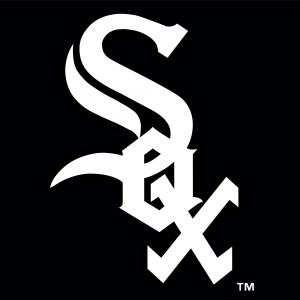
3) White Sox
The Chicago White Sox were originally called the Chicago White Stockings, which is way more awesome, in my opinion. Their name was a reference to the earlier name of the Chicago Cubs, who were themselves the White Stockings before the got all cute and cuddly.
This logo is pure American baseball. The latticed lettering and serif font places this team firmly among the old guard of our national pastime. The clean black and white is a massive step up from the clumsy blue and red of their earlier days, but perhaps a step down from their 1912 logo, which manages to step up both the simplicity and the Americana.
This one loses points for its flourished S, however, which complicates the simplicity of the ‘O’ and the ‘X’. Why mess with a good thing? Still, it’s sharp and clean overall, just lacking an iconic element that would bump it up the list.
It’s also completely insane that this team wears black socks. YOU HAD ONE JOB.
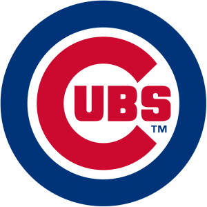
2) Cubs
Try your best to forget that night you were working too late in the library and stumbled toward the Red Line only to discover it filled rail to rafters with drunk Wrigley bros yelling incoherently and making the entire eastern side of the city physically and emotionally uncomfortable — because this logo is one of Chicago’s best.
I hate overzealous American patriotism as much as the next frustrated socialist, but baseball might be one of this country’s most genuinely charming traditions. The Cubs logo invokes that tradition with its pure red, white, and blue motif that recalls the (however flawed) down-home patriotism of the county fair and the Midway. It helps that Wrigley Field itself is one of America’s oldest-standing stadiums. Folks have been eating ketchup-free hot dogs and catching foul balls there for more than a century.
This logo is design simplicity at its best. A circle is always a reliable foundational shape; in this case, it lays the framework for the ‘C’ itself. The “UBS” breaks up what would become monotony if the ‘C’ continued its circular motion thus making the image more dynamic.
Line weight is key here. The circle and the ‘C’ are both exactly the same width, giving the entire image a clear stylistic consistency, something the Blackhawks could learn from.
The ‘TM’ detracts from everything the logo has going, but I suppose it’s better off inside the circle than outside it, where it would break the neatness of the image completely.
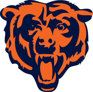
1) Bears
Originally named the far less imposing “Decatur Staleys,” the Bears have been a part of the NFL since the founding of the league itself. In 1922, coach George Halas thankfully changed the name to the “Bears” in reference to the Chicago Cubs. (Everyone loved the Cubs, apparently.)
This logo is Chicago’s best. While blue and orange is a color combination that never made much sense to me, the Bears logo is a perfect balance of many different factors. First of all, we don’t need any text to know the name of this team: They’re bears. Also, this bear actually looks menacing! It’s going to beat you in sports!
Its most impressive feat, however, is its clear sense of artistic style. This bear is not a cartoon, but it’s also not a scientific drawing. There are heavy shadows, giving a strong sense of light and dimensionality, unlike the Bulls and Blackhawks logos, which are flat and lifeless. There’s drama here! Watch out! The nuanced style is used smartly and economically: The nose and teeth are each created solely from cleverly-rendered negative space.
The Bears logo is proof that simplicity and realism can work together. The artist’s commitment to consistent line weight, limiting the palate to just two colors, and not drawing a goofy bear-toon make this logo the best in the city. Great work, person! Go Bears.


