Paint Paste Sticker: Chicago Street Art

When it comes to street art, opinions differ. Is it an eye sore, or a treat for the eyes? Regardless of the ongoing debate around this genre’s aesthetic value, street art maintains a basic purpose: to enhance whichever landscape it befalls. It keeps growing, in both complexity and popularity, yet it still has to steadily navigate the grounds of legality, professionalism and space. In an impressive display of artists’ mediations on these realities, the Chicago Cultural Center is currently hosting Paint Paste Sticker: Chicago Street Art, running now through January 12. If opening night this past October was any indication, the show is embracing a diverse crowd of street artists and aficionados.
The works spring out of the mind, onto the walls, into the world, inside the gallery and back again. Before entering the exhibit, just after a bombed-out bus shelter, sits a larger-than-life replica of a sticker that helped to inspire this all: it simply says, “You Are Beautiful.” Its ten-year journey has brought it from humble beginnings as nothing more than an inspirational message printed on adhesive backing to a full-on phenomenon. The project, originally initiated by Matthew Hoffman, has grown to include larger collaborative undertakings by artists and policy makers in the form of public installations, block murals and more.
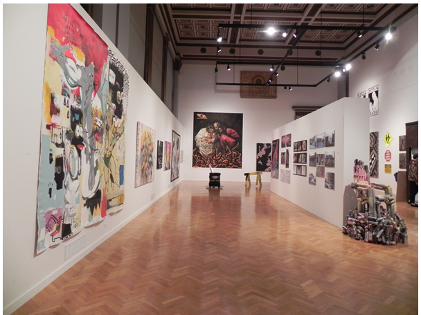
Once inside, visitors are greeted by a large inflated object that must have been tagged to no end by a giant, given its size. From there on, spanning left to right, are offerings of all kinds ranging across sculpture, canvas, installation and more. Art runs around the exhibition hall, up the walls like a crazed spider. The show is painstakingly balanced given the dizzying array of artwork. Some of the works punctuate the art form itself, while others push at its boundaries with indomitable force.

Just past a somewhat odd installation replete with a sleeping body hangs a diptych by Francisco “The Champ” Radah. It’s a collage of Sunday newspaper comics imposed upon by the eyes, nose and mouth of a much larger face in black bold paint. By way of scale and simplicity, it’s a mild but effective blackout piece. At opposite, on the back wall, is a lesson in diligence by William “UneeK” Weyna: two pieces of framed acrylic showcase the art of tagging through an assortment of scribing tools in varying color. It’s a hectic, tags-gone-wild adventure of sorts. A densely-layered presentation of signatures with flowing zigs and zags controls the larger of the two pieces while the other gives way to broader nibs with additional thinner scrawls underneath.

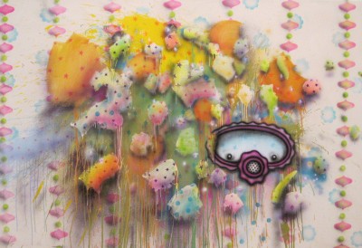
Further down the wall there’s a seemingly effortless yet magical untitled piece by Nice One. Splatters of white, orange, and pink, soft and dripping at the edges, advance and recede through a beaded curtain of cascading pink ellipsis. This piece, on canvas and accentuated by faint brush work, has all of the elements familiar in his work: warm hues, soft edges and piercing points, the awe-inspiring effect invoked by his masked mascot and the overall sense of movement. It’s appeasing and modest.
Standing at the center of the exhibition, it’s easy to notice two exemplary pieces sitting high at opposing ends of the gallery walls: Rahmaan Statik’s “The Incredulity of Saint Thomas” (2013) and Brooks Blair Golden’s “Nesting II” (2013). These works consider the implications of the space along with the attributes and idiosyncrasies of their medium. The effect is that they engage with the viewer in a different manner. The relationship between the gallery space itself, the surface material, and the medium, work in partnership towards rerouting the notion of an object placed into a space to that of an object relating with the space. This doesn’t affect the merit of other pieces: they endeavor in their own right.
The former, Statik’s “Incredulity,” is as it proclaims: an all-but-faithful reproduction of the Caravaggio masterpiece of the same name. But, at 13-by-10 feet and completely executed in spray paint on canvas, it serves not only as a nod but also a challenge, and ultimately, a proclamation of legitimacy. It’s an act of homage to both art history and the medium itself.


