Artwork aside, there are good ideas and bad ideas for album packaging. Don’t get me wrong – I get it: an album is a work of art, and works of art are supposed to push the boundaries from time to time. Raise questions. Challenge ideals. Get you thinking. Packaging, along with artwork, is often the first encounter you have with the album’s statement, and it’s also one of the most-neglected portion of the statement, so why not bring it to the foreground? Somewhere between concept and reality, that vision gets lost in translation. Below we recount seven examples of bizarre album packaging in order from whimsically unnecessary to undeniably horrifying.
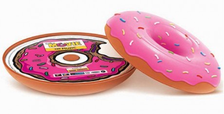
1. The Simpsons Movie Soundtrack (2007)

(link)
Pros: It’s thematic, novel and playful. As the iconic craving for Homer Simpson’s American “everyman”, there’s nothing quite like fried dough, glazed with an unnatural pink sheen, dotted with little bits that taste like chalk, and filled with purple stuff (which, according to Homer, is a fruit).
Cons: First and most egregiously, the donut has no hole, which makes it look kinda like a frosted Saturn peach or something. Second, the case actually smells like a donut, which carries a high ick-factor if your collection is housed in anything without access to an occasional breeze. (Although it could be a nice conversation piece if you had to explain to someone why your Pantera CDs smell so delicious.)
Aside from that, storage is predictably awkward if you want to store it on your shelf. CDs are round and CD cases are not — there’s a reason for this. Which, actually leads us into…
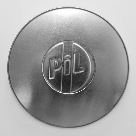
2. Public Image Ltd. – Metal Box (1979)

(link)
Pros: It’s sleek and futuristic, especially from the man who was tooling around with ransom type on pink backgrounds only two years earlier. John Lydon, frontman of PiL, also collected vinyl, and he claims that the 12-inch canister properly protected his records.
Cons: Storage. Definitely. While the Simpsons Movie Soundtrack’s donut was a circular case, it also came in a box, which was designed to be a generic and uninspired version of a Krispy Kreme box. It was bulky, but at least it kept the thing from rolling off your shelf.
Second, according to owners of original metal canister, the three 12″ records inside were only separated by thin sheets of paper, and fitted extremely close to the edge of the container, making damage to the vinyl almost inescapable. Oh well, it’s the thought that counts.
It’s also worth nothing that a major problem with any “Special/Collector’s/Limited Edition” packaging is the cost shouldered by the producers. This innocent looking metal box container apparently forced the band the give up most of their advance (out of their own wages) in order to pay for the costs.
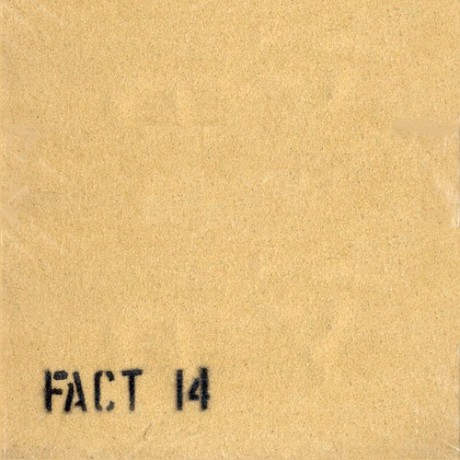
3. The Durutti Column – The Return of the Durutti Column (1979)

(link)
Pros: Classic Factory Records design. It’s minimal, industrial and subversive.
Cons: Taking a cue from Situationist International member Guy Debord and his first book on psychogeography titled Mémoires, the entire sleeve of the early limited run of The Return of the Durutti Column is created with industrial grade sandpaper, which means that the sleeves of whatever records you store next to FACT 14 will be eventually destroyed. Is there any other statement more mischievous, more self-important, more quintessentially Factory Records than destroying other works of art with your own?


