By Caroline Liebman
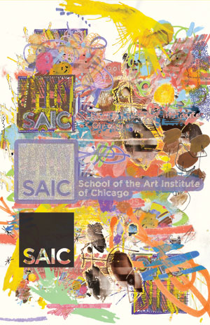
Illustration by Luke Armistead
 The School of the Art Institute of Chicago launched a new logo after displacing Katie Friedman’s long-standing black and red un-logo. The logo, which came by way of Leo Burnett, is showing up more frequently on windows, doors, stationary, and was at one point the focus of the school’s website. Now that students have had some time to get used to the new branding, F News asked students what they think. Head over to the fnewsmagazine.com forum to join the discussion.
“I like it. It’s not overdone like a lot of other colleges”
Favorite Logo: Gatorade
Storm Campo, First year student
“It’s better than the last one.”
Favorite Logo: N/A
Tom B.
“It’s straight up.
I’m o.k. with it.”
Favorite Logo: “McDonald’s, becaue of the history behind it.”
Marcel Alcala, Painting
“It’s simple and effective.”
Favorite Logo: “I don’t like logos.”
Brandon Seckler, Painting
“It’s postmodern, it fits the SAIC tradition.”
Favorite Logo: N/A
Molly, Performance
“It’s not detestable. I can see the criticism that it’s a corporate label.”
Favorite Logo: “Target has good branding.”
Niki Yowell, New Arts Journalism
“It’s boring—it’s a square.”
Favorite Logo: N/A
Mandy Johnston, Film, Video, New Media
“You would think at an institution with such an interesting population… why wouldn’t they have the logo reflect that?”
Favorite Logo: The K Records Logo
Jesse, Performance/Writing
“I don’t think it actually represents the experience of going here, more the illusion of it.”
Favorite Logo: NSYNC
Crispin Rosenkranz, Film, Video, New Media Grad
“It’s institutional, combined with a clear business accreditation. I think the students should redesign it.”
Favorite Logo: A dot
William Amaya, Various Studies
“It’s representative of the weakness of the art institution.”
Favorite Logo: N/A
Patrick
“I have a huge problem with the school setting up outside help [to create it]. Why go out of house? It’s offensive to the students who are paying money to go here.”
Favorite Logo: “I like Cranbrook’s logo.”
Elise Goldstein, Sculpture Grad


