

As an artist whose practice has been limited by disability and chronic illness, I’ve often struggled with accepting the limitations in what I want to do versus what I am actually capable of.
My autism and dyspraxia make learning new spatial and visual skills much more challenging for me than for many other people, and I’ve often found myself incredibly frustrated sitting in front of a drawing that doesn’t look like what I had in mind, or what an abled artist could achieve, no matter how hard I try. These roadblocks make what should be cathartic forms of self-expression into reminders of the disconnect between my mind and body. I think that’s why I love to write so much; it’s one of the few mediums in which I feel that my skills can do my imagination justice.
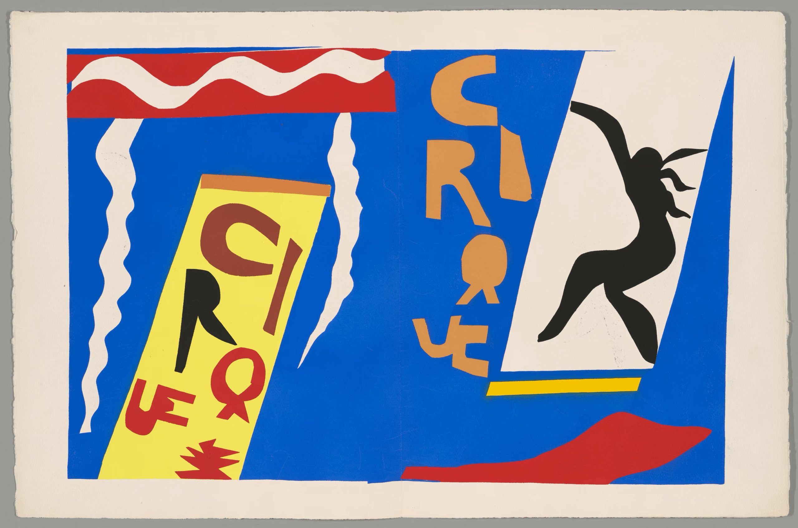
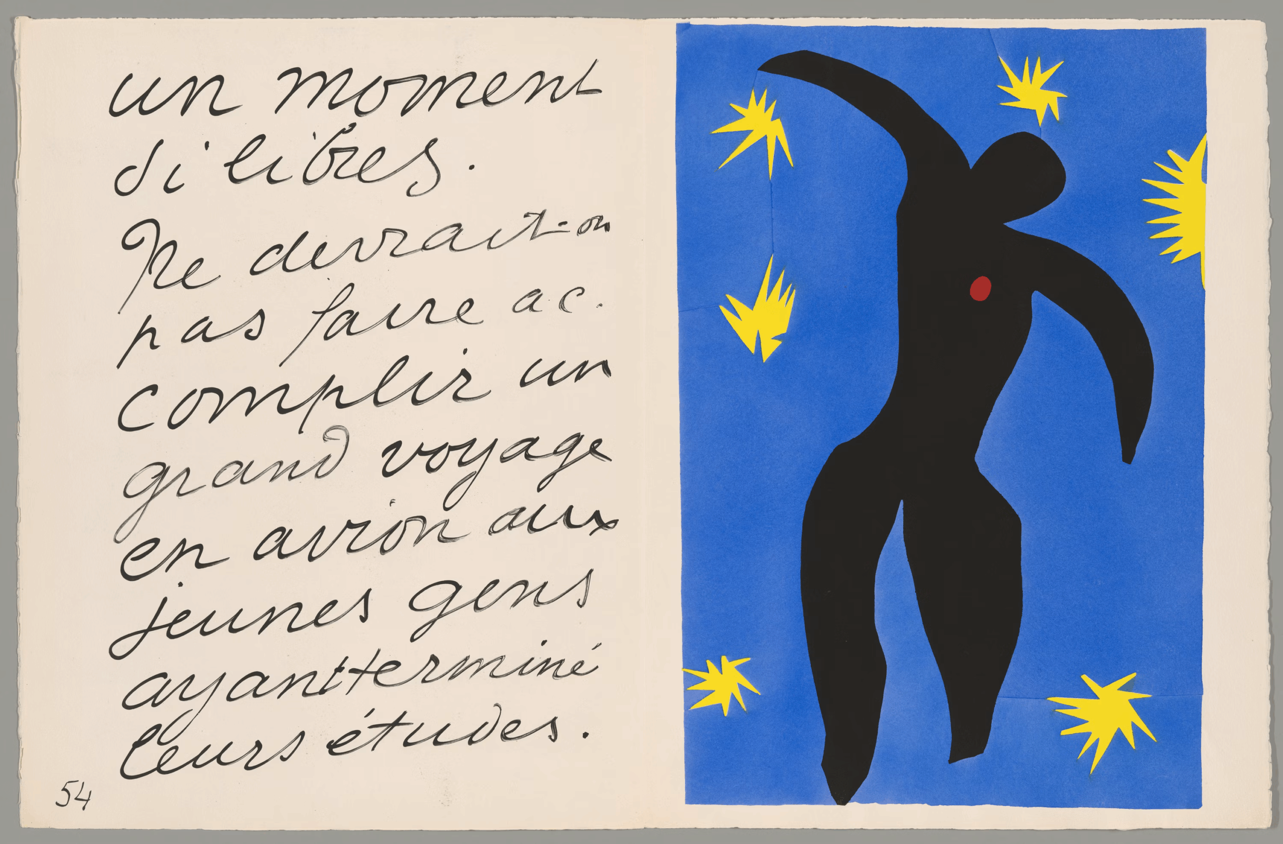
I can imagine that Henri Matisse might have felt similarly in the waning years of his life, when he was bedbound following abdominal cancer surgery and could no longer engage in the mediums that had brought him renown. Unable to paint or sculpt, Matisse turned to what he referred to as “drawing with color”: cutting shapes out of vibrantly-colored paper and using the cutouts to create works of collage and decoupage.
While the Art Institute of Chicago’s exhibit “Matisse’s Jazz: Rhythms in Color” showcases pieces from throughout Matisse’s career, the focus of the show is on this period. While the AIC has owned “Jazz” since 1948, immediately after the works’ creation, “Rhythms in Color” marks the first time the museum has shown the collection of pieces in their entirety.
Overall, I had mixed feelings about the exhibit. I have nothing but good things to say about the actual pieces featured, but while some of curator Emily Ziemba’s choices were well thought out, other decisions fell short and didn’t do the works justice.
The first thing a visitor sees upon entering the “Rhythms in Color” gallery is just that: the vibrant paper cutouts that are the exhibit’s primary focus. I was a little starstruck witnessing some of these pieces; “Icarus,” in particular, was a real treat to see in person after having encountered it everywhere from dorm room posters to the cover of “The Body Keeps the Score.”
“Drawing with color” is an excellent way to describe the “Jazz” series. The vivid ultramarine blue that appears in each piece is especially brilliant in person in a way photographs and prints simply can’t. Color indeed becomes a medium of its own. However, I was somewhat disappointed in the dim lighting of the exhibit. I understand that dim lighting is often necessary in the conservation of delicate pieces of art, but it seemed like a real shame to encounter an exhibit so predicated on the power of vivid color presented in a way that subdues their vividness through its lighting design.
The curation makes note of the historical context of “Jazz:” Matisse created these works during and immediately following the Nazi occupation of France during World War Two. The exhibit positions the “Jazz” pieces as an act of “quiet resistance,” of art as joy in a time of sorrow. (As the exhibit text informs us, Matisse’s own daughter Marguerite, a member of the French Resistance, was tortured by the Gestapo and spent time in a concentration camp.) It is important during dark times in our own nation to look at art as resistance to fascism, certainly.
Still, the connections the curator attempted to weave between the pieces and their historical context felt like a stretch. The exhibit text suggests that “‘The Wolf’ might symbolize the “Gestapo” and that the stars in “Icarus” resemble artillery shells, and then, two paragraphs below on the same label, asserts that Matisse’s art was “never overtly political.” I left the exhibit feeling unsure about the intentionality of this kind of symbolism in Matisse’s works. It felt a little bit like an attempt to assure audiences that “Jazz” remains relevant in the modern era, rather than a thorough examination of resistance to fascism via art.
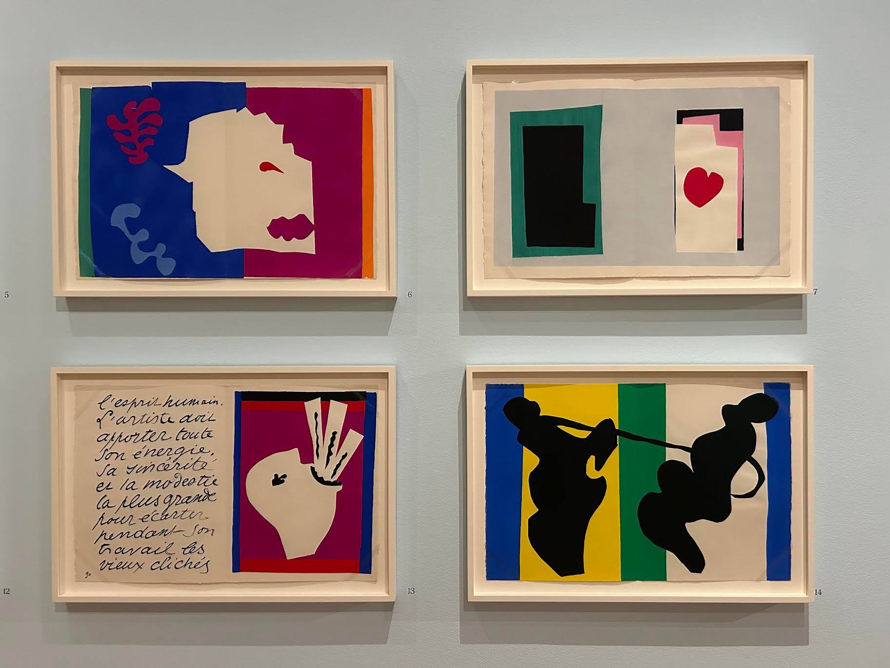
The layout of the exhibition had benefits and drawbacks. The exhibit is not arranged chronologically; visitors entering the gallery witness the large main room devoted to the “Jazz” prints before encountering Matisse’s older works in the hallways behind it. This is one of the better curatorial decisions that Ziemba made — it’s important, I think, not to see the “Jazz” series as a regression or denigration as Matisse lost certain abilities but rather an evolution as he adapted.
While Matisse became more limited in the “Jazz” era, I think he became more creative due to his limitations, doing things that hadn’t been done yet. It’s especially interesting to notice the stylistic through-lines in Matisse’s career; once you see Matisse’s exploration of shape and human form in his cutouts, it becomes more apparent in his older pieces. Despite shifts in medium and ability, it’s the same artist with the same vision.
My favorite piece from the exhibition was one of Matisse’s earlier works, “Laurette With A Cup of Coffee,” which was painted between 1916 and 1917 — nearly 30 years before Matisse began work on his papercuts; I’m glad that Ziemba chose to include it and other works from Matisse’s painting career.
However, I felt like including Matisse’s earlier works, especially sticking them in a hallway, felt a bit like an afterthought next to the shiny focal point of the “Jazz” papercuts. It made the layout and the narrative of the exhibition feel disjointed and chaotic. The layout of an exhibition need not be traditional or chronological, but despite the stylistic through-lines, I kept getting the sense that the exhibition had a bit of an identity crisis. It hadn’t quite made up its mind as to whether it was a Matisse exhibition or an exhibition of Matisse’s papercuts.

Visitors take in Matisse’s Jazz: Rhythms in Color featuring works by Henri Matisse. Printed by Edmond Vairel, published by Tériade for Éditions Verve. The Art Institute of Chicago, Simeon B. Williams Fund. © 2026 Succession H. Matisse / Artists Rights Society (ARS), New York.
This was made even more apparent in the placement of my other favorite piece in the gallery, “Oceania — The Sea.” Despite having been placed in the back hallways with works from earlier in Matisse’s career, “Oceania” is a cut paper piece made in 1948. Its placement there felt a little haphazard, and not particularly intentional.
While there were certainly flaws in the exhibition, I had a fantastic visit. Despite the ubiquity of so many of these images, prints and reproductions really don’t do them justice; seeing them in person is a real treat that I wholeheartedly recommend you take the time to experience. “Matisse’s Jazz: Rhythms in Color” will be on display at the Art Institute of Chicago through June 1.
This article is part of a series called “What’s On At The AIC?” I find that I go to the Art Institute much less than I’d like to, and I’m hoping that this series will encourage me, as well as you, the reader, to take advantage of our world-class museum and the exciting new temporary exhibitions that are shown there.


