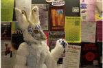

Saul Steinberg, “Fur Coats,” 1951. Gift of the Saul Steinberg Foundation.
Saul Steinberg, a Romanian émigré whose drawings were featured on gallery walls (and New Yorker covers) for decades, coined himself “a writer who draws.” But to call oneself a writer at all is an unavoidably ambiguous declaration, which becomes infinitely more confusing with the added context of images.
The 54 illustrations currently on display at the Art Institute of Chicago are drawn with a variety of mediums, but the product is always the same: line on surface. What those lines and surfaces say varies with each image; an alphabet of twenty-six letters is no less simple, nor less versatile.
In some cases, Steinberg’s pictures read as easily as a clear-minded journalistic critique. In “Fur Coats,” he calls out over-the-top bourgeois style, drawing big, expensive animal pelts with the minimum number of dots and dashes they require — shrouding their blank-faced wearers beneath a cloud of hot air. He does this again in “Motels and Highway,” depicting the paved arteries of America as cluttered, dirty places, abounding with neon sensory overload.
And again in “Untitled (Fast Food)”: Steinberg’s materials are employed to dispel the mystique of a growing trend in 1970s America. His characters are bulging out of their disco-ready clothes, spilling sauces and sugary drinks down pant legs as their eyes bug out to look at nothing. These drawings leave one disturbed at their own excess, yet they create such a feeling with the simplest pen and brushstrokes.
Steinberg, however, is not limited to the clear-cut, journalistic style one associates with political cartoons. “Certified Landscape” is a drawing made entirely of black ink stamp impressions on woven, ivory-colored paper. There is a road in the foreground, hemmed in by a fence. Beyond, there are freshly-ploughed fields, a large barn, and an industrial grain silo, about which there are a number of small, silhouetted figures. Besides an easily-spotted and banal critique of the EPA (which would begin regulating industry the year following this work’s completion), there is nothing here to make a viewer feel bad about themselves. If anything, what’s shown is an examination of drawing as a medium.
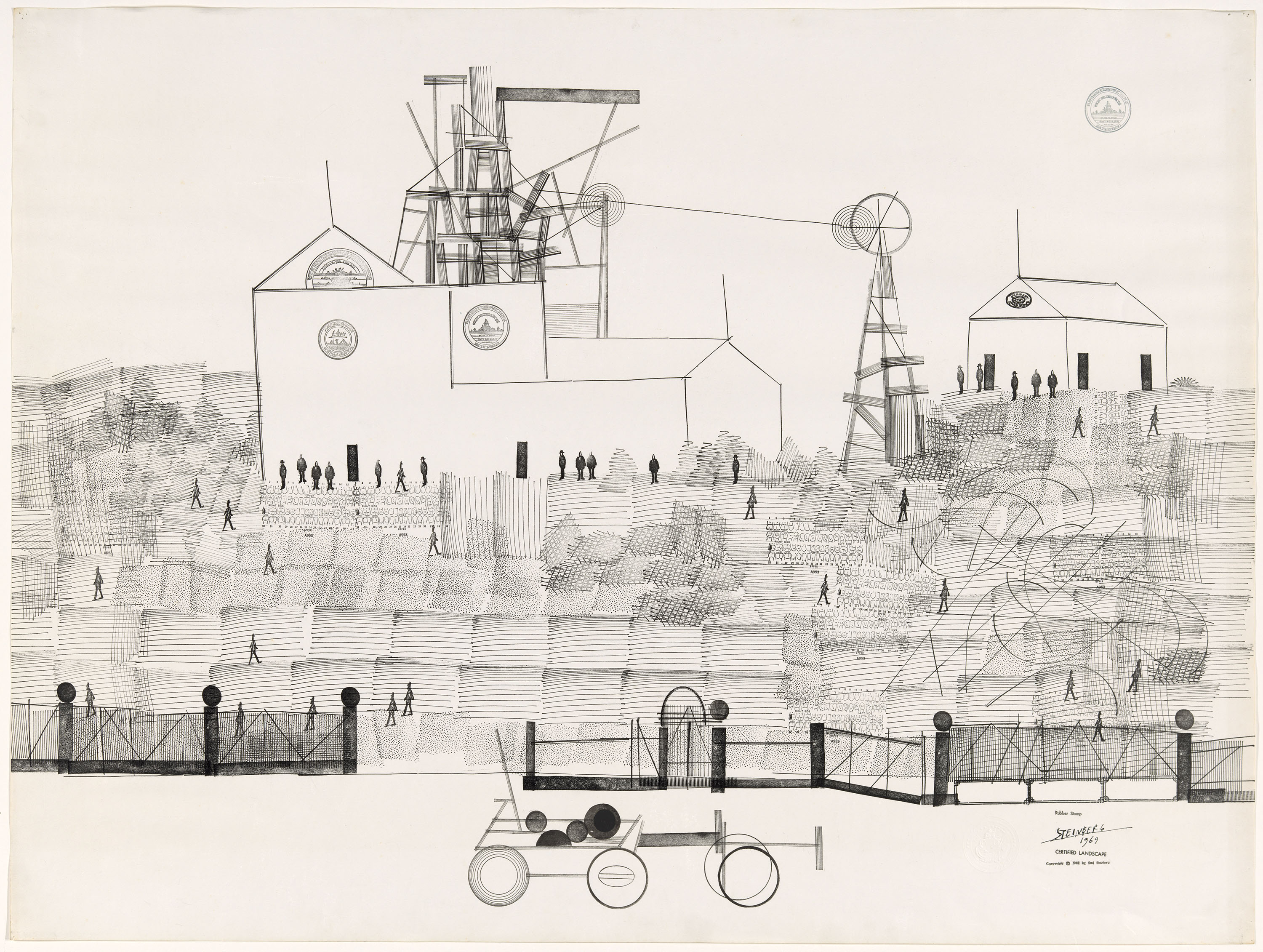
Saul Steinberg , “Certified Landscape,” 1969 . Gift of the Saul Steinberg Foundation.
Steinberg can be seen testing the limits of his own practice, creating his own limited number of stamps to complete the ‘drawing’ in fewer than ten marks. It shows an artist who, in addition to being critical of the world around him, is also critical of the media with which he critiques that world.
Steinberg possesses the versatility to also take flights of fancy, latching onto things which seem to interest him purely for interest’s sake. In works like “Rain on the Hiroshige Bridge II; III; and IV,” Steinberg can be seen shaping an idea. The works are hung sequentially, left to right, beginning with II and ending with IV. The first shows a childlike landscape with a far horizon holding in a simple bridge. Across the bridge there are people scurrying, a torrent of rain targeting them directly as they run, clinging to their umbrellas. The rest of the landscape is bone dry.
The second iteration takes this idea further, zooming in on the bridge, and showing four individuals struggling across with umbrellas that are each being pelted by their own unique columns of jetting water. Again, an untouched landscape lies beyond.
The third sees Steinberg taking a completely new approach: the bridge again, more people, more naturally depicted, with rain covering the lens of the viewer, finally enveloping the whole of the picture.
Whether Steinberg, on arriving at the fourth iteration of “Rain on the Hiroshige Bridge,” was satisfied with its final state, or simply content with what he learned from each drawing and their relationships to one another, is a topic worthy of discussion — and one relevant to any written or visual practice.

Saul Steinberg , “Rain on Hiroshige Bridge III,” 1980 . Gift of the Saul Steinberg Foundation.
The thesis of the show is in two pictures located in the rear gallery. “Untitled (Braque, bric a brac…)” and “Untitled (Equestrian Monument with Speech Balloons)” each illustrate the effusion of words that comes along with any visual piece of art.
In “Braque,” a character stands before a painting on a wall. Spouting from his head are little puffs that lead to a massive thought cloud, which takes up the majority of the picture, and contains a list of hundreds of words which have come in and out of the cartoon viewer’s consciousness.
“Monument” is much the same: A generically heroic war statue (man; horse; pedestal) is surrounded by five speech bubbles full of filigree words, so aggressive that the monumental horse is backing away and snorting — certainly an interesting piece in the wake of the Confederate zeal of these last months.
Whatever their individual intents, these pieces speak to Steinberg’s proclamation of practice, putting images and words side by side to lock them together in an ongoing conversation and commentary. They’re incapable of fully describing each other, yet completely integral to one another. A writer who draws indeed.
“Along the Lines: Selected Drawings by Saul Steinberg” is on view at the Art Institute of Chicago through October 29, 2017