In the Rocky Mountains, the winter fades and the affair between the skier and the snows begins to disintegrate. The rising temperatures initiate a mourning process — an annual “auf wiedersehen” to the chill and the winter storms. To go on about the seasonal shift would be to beat a beast long dead, but many are starting to speak to the loss of winter on a general, more macro level. This notion of ‘world warming’ (to throw a wrench in an overused phrase) is getting realer. If these balmy winters keep up, we may have to find new uses for our merino wool.
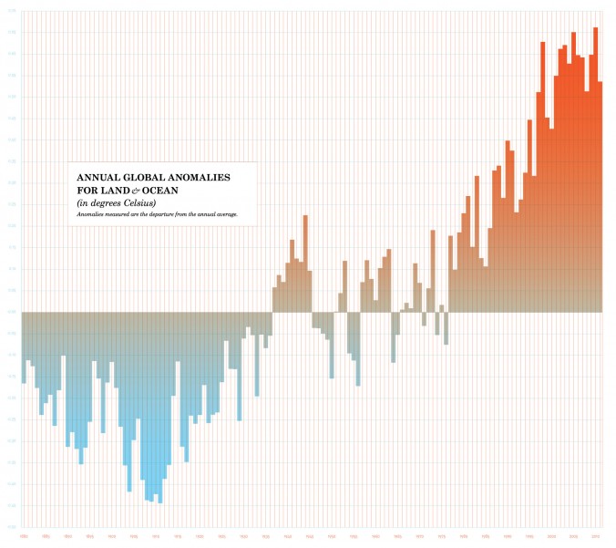
Infographic by Alli Berry. Source: “Global Surface Temperature Anomalies.” National Climatic Data Center: National Oceanic and Atmospheric Administration.
There is a time each year when the temperatures begin to wax and the death of the winter enfolds us. Different places deal differently with the approach of spring. In Chicago, a sigh of relief resonates across the lakefront, and layers are shed with bold resolve. In the Rocky Mountains, the winter fades and the affair between the skier and the snows begins to disintegrate. The rising temperatures initiate a mourning process — an annual “auf wiedersehen” to the chill and the winter storms. To go on about the seasonal shift would be to beat a beast long dead, but many are starting to speak to the loss of winter on a general, more macro level. This notion of ‘world warming’ (to throw a wrench in an overused phrase) is getting realer. If these balmy winters keep up, we may have to find new uses for our merino wool.
In January of 2007, N+1 Magazine published a selection of short vignettes titled “Eulogies for Winter,” in which editors and contributors wrote recollections of winters past. They contrasted the sepia-toned winters of their childhoods to the increasingly milder, warmer winters of the last decade. A front-page report in the New York Times by Justin Gillis (January 9, 2013) reported that 2012 was the United States’ hottest year ever by a full degree Fahrenheit — a large margin considering that most discrepancies in average yearly temperature vary by small fractions of a degree.
Media and citizens alike are murmuring about this new warmth. Passersby in Chicago often remark on the fact that they are only wearing one pair of pants in December! As we observe these patterns of warming, other impulses arise as well. One may be an atrocious bout of nostalgia for winters of old or an embarkation into Mme. Kübler-Ross’s “Five Stages of Grief.” Logic-minded folk may want to extend beyond “it’s what science tells us” and demand to know just how we are able to make statements about the average temperatures of the Earth. Whether the topic brings emotional upheaval or a demand for empirical brain-fill, it merits exploration.
_________________________________________________________
The Data
According to the Environmental Defense Fund, the World’s annual temperatures are amassed and disseminated by four scientific fixtures including NASA, NOAA (National Oceanic and Atmospheric Administration), CRU (Climactic Research Unit), and JMA (Japan Meteorological Agency). NASA and NOAA, based in the US, mutually gather land surface temperatures from the Global Historical Climate Network-Monthly (or to adorn this paragraph with yet another acronym — the GHCN-M).
The GHCN-M gathers temperature data from rural and urban stations worldwide. The data gathered from the GHCN-M (and made formally available as graphs, pdfs, and tabular sets by both NOAA and NASA) does not precede 1880 due to “poor spatial coverage of stations and decreasing data quality prior to that time” (NASA). Finally, these graphs and tabular sets do not record absolute data — they record anomalies. Rather than reporting a temperature of, say, 30 degrees Celsius in January of 1967, this data give us a small increment like ‘-2’ or ‘1’ (also in degrees Celsius) to represent the departure from the average.
This notion of anomaly opens up yet another drawer in the endless statistical apothecary of who’s-gathering-what-number-when, and what-crevasse-is-it-coming-from. But, it turns out the use of anomaly is a more logical and less erratic form of measure, especially in bleak and vertiginous places like the Dolomites or the Sahara. So, to go along with the Italian mountain analogy, the Dolomites may be enjoying a cooler summer than usual, but the average temperature in the town of Falcade (3,822 ft) would wildly differ from the read atop Marmolada (10,968 ft), a nearby peak. These cooler summer temperatures are thus compared to their respective baselines — a collection of more frequently recorded, localized, reference temperatures — resulting in the anomaly value.
So in the end, what we look at when we Google this stuff (“stuff” being the average temperature of the Earth over time) on the Internet is typically a box plot / bar graph hybrid constructed by dear NASA or NOAA from data recorded by the GHCN-M. This box plot / bar graph hybrid entitled Jan-Dec Global Mean Temperature Over Land & Ocean has a very obvious visual trend. It’s reminiscent of seeing a world-population-over-eternity graph, but not quite as terrifying.
The trend is, well, up.
_________________________________________________________
The Last Day (L’Adoration de la Terre)
The town of Alta, Utah sits 10 miles up Little Cottonwood Canyon. It receives about 500 inches of snowfall annually and it’s an ideal place for all manner of ‘sliding’ sports — skiing being the most predominate.
As spring nears, the creeks begin to roar, and the early morning snow takes on an entirely new texture. After a full season of powder and sugar and crud, the spring turns ski slopes into corn — a fleeting consistency that starts in the lower southeast elevations and moves vertically west, leaving lower pitches mushy and wet. Skiers follow a phototropic path, an invisible band of perfectly temperate snow that finally dissipates altogether.
When it is too warm for corn, the roads fill with slushy muddy water. In the stead of hot chocolate, skiers drink beer and lemonade in lawn chairs at the base of the lift, wearing only T-shirts. Their heads tilt back, eyes closed, goggles on, reveling in the beautifully contrarian feeling that is springtime in the mountains — the chill of the snow around your boots, the breeze at 9,000 feet, and the heat of a newer, more gallant sun.
Finally, spring arrives and the lifts at Alta come to a halt. In a final, apocalyptic gesture of camaraderie and farewell, droves of beer-blushed, costumed skiers traverse to the top of Alf’s High Rustler, one of Alta’s higher, steeper classics. From atop the peak, booze is flung into the air, music chortles from a variety of bring-your-own sources, and most (wearing only bikinis and ski boots) pounce around like lunatics as the sun goes down. Winter has finally ended.
_________________________________________________________
The Departure From Average (Le Sacrifice)
If all this discussion of data and Mean Temperature Over Land & Ocean does one thing, it hopefully leads to consideration of wintertime’s significance. With any luck, it’s a reminder that the hot chocolate tasted so good because the snow-fort construction / ensuing snow battle rendered your fingers so useless, you had no choice but to let the snot freeze to your face. And even if frozen snot wasn’t a part of your childhood, there were always cooler temperatures, or larger swells, or migratory birds.
It may not grace any of our lifetimes, but “winter” may gradually change in definition. Though Alta’s Rite of Spring occurs yearly, one can only hope that if winter is to disappear indefinitely, we can all laud its memory in a similarly jubilant fashion. It’s not what Stravinsky intended — no virgins will be sacrificed (though they could be) — but it would make an appropriate theme for a future winter, one day, as it dances itself to death.
_________________________________________________________
Sources:
“Global Surface Temperature Anomalies.” National Climatic Data Center: National Oceanic and Atmospheric Administration.
“How We Know the Earth is Warming.” Environmental Defense Fund.
“GISS Surface Temperature Analysis (GISTEMP).” National Aeronautics and Space Administration: Goddard Institute for Space Studies.


The Rights of Spring
Lament for Winter in Three Parts
In the Rocky Mountains, the winter fades and the affair between the skier and the snows begins to disintegrate. The rising temperatures initiate a mourning process — an annual “auf wiedersehen” to the chill and the winter storms. To go on about the seasonal shift would be to beat a beast long dead, but many are starting to speak to the loss of winter on a general, more macro level. This notion of ‘world warming’ (to throw a wrench in an overused phrase) is getting realer. If these balmy winters keep up, we may have to find new uses for our merino wool.
By Alli Berry February 15, 2013 Uncategorized
Infographic by Alli Berry. Source: “Global Surface Temperature Anomalies.” National Climatic Data Center: National Oceanic and Atmospheric Administration.
There is a time each year when the temperatures begin to wax and the death of the winter enfolds us. Different places deal differently with the approach of spring. In Chicago, a sigh of relief resonates across the lakefront, and layers are shed with bold resolve. In the Rocky Mountains, the winter fades and the affair between the skier and the snows begins to disintegrate. The rising temperatures initiate a mourning process — an annual “auf wiedersehen” to the chill and the winter storms. To go on about the seasonal shift would be to beat a beast long dead, but many are starting to speak to the loss of winter on a general, more macro level. This notion of ‘world warming’ (to throw a wrench in an overused phrase) is getting realer. If these balmy winters keep up, we may have to find new uses for our merino wool.
In January of 2007, N+1 Magazine published a selection of short vignettes titled “Eulogies for Winter,” in which editors and contributors wrote recollections of winters past. They contrasted the sepia-toned winters of their childhoods to the increasingly milder, warmer winters of the last decade. A front-page report in the New York Times by Justin Gillis (January 9, 2013) reported that 2012 was the United States’ hottest year ever by a full degree Fahrenheit — a large margin considering that most discrepancies in average yearly temperature vary by small fractions of a degree.
Media and citizens alike are murmuring about this new warmth. Passersby in Chicago often remark on the fact that they are only wearing one pair of pants in December! As we observe these patterns of warming, other impulses arise as well. One may be an atrocious bout of nostalgia for winters of old or an embarkation into Mme. Kübler-Ross’s “Five Stages of Grief.” Logic-minded folk may want to extend beyond “it’s what science tells us” and demand to know just how we are able to make statements about the average temperatures of the Earth. Whether the topic brings emotional upheaval or a demand for empirical brain-fill, it merits exploration.
_________________________________________________________
The Data
According to the Environmental Defense Fund, the World’s annual temperatures are amassed and disseminated by four scientific fixtures including NASA, NOAA (National Oceanic and Atmospheric Administration), CRU (Climactic Research Unit), and JMA (Japan Meteorological Agency). NASA and NOAA, based in the US, mutually gather land surface temperatures from the Global Historical Climate Network-Monthly (or to adorn this paragraph with yet another acronym — the GHCN-M).
The GHCN-M gathers temperature data from rural and urban stations worldwide. The data gathered from the GHCN-M (and made formally available as graphs, pdfs, and tabular sets by both NOAA and NASA) does not precede 1880 due to “poor spatial coverage of stations and decreasing data quality prior to that time” (NASA). Finally, these graphs and tabular sets do not record absolute data — they record anomalies. Rather than reporting a temperature of, say, 30 degrees Celsius in January of 1967, this data give us a small increment like ‘-2’ or ‘1’ (also in degrees Celsius) to represent the departure from the average.
This notion of anomaly opens up yet another drawer in the endless statistical apothecary of who’s-gathering-what-number-when, and what-crevasse-is-it-coming-from. But, it turns out the use of anomaly is a more logical and less erratic form of measure, especially in bleak and vertiginous places like the Dolomites or the Sahara. So, to go along with the Italian mountain analogy, the Dolomites may be enjoying a cooler summer than usual, but the average temperature in the town of Falcade (3,822 ft) would wildly differ from the read atop Marmolada (10,968 ft), a nearby peak. These cooler summer temperatures are thus compared to their respective baselines — a collection of more frequently recorded, localized, reference temperatures — resulting in the anomaly value.
So in the end, what we look at when we Google this stuff (“stuff” being the average temperature of the Earth over time) on the Internet is typically a box plot / bar graph hybrid constructed by dear NASA or NOAA from data recorded by the GHCN-M. This box plot / bar graph hybrid entitled Jan-Dec Global Mean Temperature Over Land & Ocean has a very obvious visual trend. It’s reminiscent of seeing a world-population-over-eternity graph, but not quite as terrifying.
The trend is, well, up.
_________________________________________________________
The Last Day (L’Adoration de la Terre)
The town of Alta, Utah sits 10 miles up Little Cottonwood Canyon. It receives about 500 inches of snowfall annually and it’s an ideal place for all manner of ‘sliding’ sports — skiing being the most predominate.
As spring nears, the creeks begin to roar, and the early morning snow takes on an entirely new texture. After a full season of powder and sugar and crud, the spring turns ski slopes into corn — a fleeting consistency that starts in the lower southeast elevations and moves vertically west, leaving lower pitches mushy and wet. Skiers follow a phototropic path, an invisible band of perfectly temperate snow that finally dissipates altogether.
When it is too warm for corn, the roads fill with slushy muddy water. In the stead of hot chocolate, skiers drink beer and lemonade in lawn chairs at the base of the lift, wearing only T-shirts. Their heads tilt back, eyes closed, goggles on, reveling in the beautifully contrarian feeling that is springtime in the mountains — the chill of the snow around your boots, the breeze at 9,000 feet, and the heat of a newer, more gallant sun.
Finally, spring arrives and the lifts at Alta come to a halt. In a final, apocalyptic gesture of camaraderie and farewell, droves of beer-blushed, costumed skiers traverse to the top of Alf’s High Rustler, one of Alta’s higher, steeper classics. From atop the peak, booze is flung into the air, music chortles from a variety of bring-your-own sources, and most (wearing only bikinis and ski boots) pounce around like lunatics as the sun goes down. Winter has finally ended.
_________________________________________________________
The Departure From Average (Le Sacrifice)
If all this discussion of data and Mean Temperature Over Land & Ocean does one thing, it hopefully leads to consideration of wintertime’s significance. With any luck, it’s a reminder that the hot chocolate tasted so good because the snow-fort construction / ensuing snow battle rendered your fingers so useless, you had no choice but to let the snot freeze to your face. And even if frozen snot wasn’t a part of your childhood, there were always cooler temperatures, or larger swells, or migratory birds.
It may not grace any of our lifetimes, but “winter” may gradually change in definition. Though Alta’s Rite of Spring occurs yearly, one can only hope that if winter is to disappear indefinitely, we can all laud its memory in a similarly jubilant fashion. It’s not what Stravinsky intended — no virgins will be sacrificed (though they could be) — but it would make an appropriate theme for a future winter, one day, as it dances itself to death.
_________________________________________________________
Sources:
“Global Surface Temperature Anomalies.” National Climatic Data Center: National Oceanic and Atmospheric Administration.
“How We Know the Earth is Warming.” Environmental Defense Fund.
“GISS Surface Temperature Analysis (GISTEMP).” National Aeronautics and Space Administration: Goddard Institute for Space Studies.
Climate Collapse, Commentary, News
Uncategorized The Rights of SpringWhere to Show Your Work
The Bathroom Blind Spot
Related Posts
The SAIC Burn Book
How Title IX Fails Those It Promises To...
‘Post’ Book Review
The Future is Brief
April 25, 2024
April 18, 2024
April 18, 2024
April 16, 2024
April 15, 2024
April 12, 2024
April 10, 2024
November 30, 2023
November 3, 2023
November 29, 2023
November 13, 2023
December 8, 2023
November 28, 2023
November 28, 2023
Post Archives