Students speak out on SAIC’s new logo

Many people have expressed to us their dislike of the new logo. Others have explained to us just how hard it is to find a single unifying image for such a diverse and peculiar school.
In our April issue, we plan to investigate the problems surrounding re-branding our school. Also, keep an eye out for F News’s own logo design contest.
—The Editors
As a Viscom student who pays a bundle to SAIC for her design education, I feel obligated to comment on the new school logo. It’s clean, simple, quiet, not bold and a bit boring. None of which are attributes I immediately relegate to the conceptual School of the Art Institute. But my beef is not with this new logo, it is with the way the school went about selecting this new logo. TimeZoneOne, a New Zealand-based design firm, created our new identity. I find it very troubling that the school’s administration did not come to its own internal department (both distinguished and capable) to develop this new logo.
Had they no faith? It would have been the perfect opportunity to get both the design faculty and students involved in a real-life identity and branding issue, a squandered chance with less than admirable results. If a mural needed to be painted on the side of the Columbus building, I hope the school would consult its own painting department or at least practicing alumni. SAIC design students lost a chance to be part of creative branding decisions and discourse. If the school didn’t even come to their own department for help, why should anyone else? Why should I believe in a department whose parent doesn’t?
—Katherine Walker
I have to say how sad and disappointed I was to see the “new” logo and by the fact that it was “created” by an outside source. It seems to me that this new logo could have been created by other incredibly talented people (faculty + students) right here in our own institution. I don’t mean to sound hysterical…well, actually maybe I do…we have a VISUAL COMMUNICATIONS DEPARTMENT RIGHT HERE!!!
I question why this revamping of the non-existent logo wasn’t offered to the department that I am thrilled to be a part of? I think what is the saddest thing to me is to know of the incredible talent that exists right here in our SAIC community through those who are my peers, students and professors and to not see the school take advantage of those talents is a sad thing indeed. It is hard enough to be recognized as a department AT ALL in an interdisciplinary art school environment, but to then go outside of the school (outside of the resources that are already HERE) to a firm which created a logo that is not only boring but absolutely uninspiring, is truly insulting.
—Nancy A. Bernardo
2nd yr. grad student, Viscom
via email
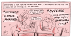
Illustration by Emile Ferris
FEBRUARY 2006