Telling Stories With Raw Data

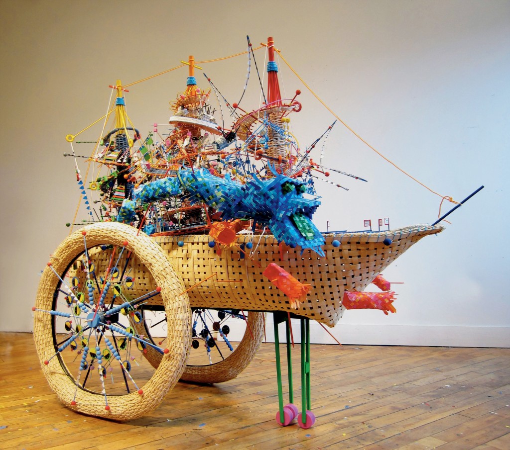
All images from Infographic Designers’ Sketchbooks by Steven Heller and Rick Landers and courtesy of Princeton Architectural Press. Above: A 3D musical score and sculpture that follows the sinking of the Andrea Gail © Nathalie Miebach, 2011
In our age of big data, the rush to keep up with the flood of information keeps readers craving visual shortcuts. To meet this, the fields of data journalism and data visualization continue to shape new methods for journalists and designers to tell compelling stories.
There has not been much discussion, however, about what constitutes a successful visual presentation of factual information. When attempts at setting frameworks for analyzing information graphics have come to light, they have become meta-considerations executed under an infographic-esque aesthetic. An example of this is designer Ivan Cash’s 2011 “Infographic About Infographics,” which sampled 49 different examples of the medium and created a data set arranged by chart styles, typography, colors and more. Cash asserts on his website that he is “by no means a professional infographic designer” and requests that he not be contacted for infographic-related projects.
Cheeky considerations of infographic facts aside, how do we find a reference point to talk about something visual that occupies a space somewhere between art and science?
One approach could be found in co-editors Steven Heller and Rick Landers’ new book Infographic Designers’ Sketchbooks, which shows how information visualization design is a series of creative decisions and employs the artist’s tool of sketching. Much like the process of writing an article, the research and planning processes behind infographics go unnoticed when viewers only get to see the finished product. The book shows a collection of unedited sketchbook pages from some of the world’s top illustrators and designers, demonstrating how art is often required to help explain all kinds of data.
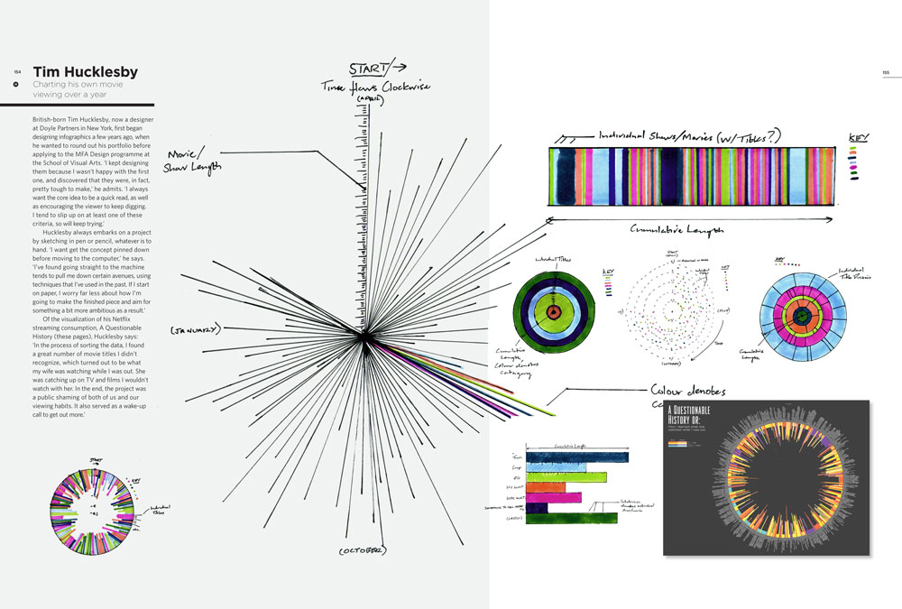
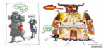
An infographic depicting movie viewing over a year © Tim Hucklesby
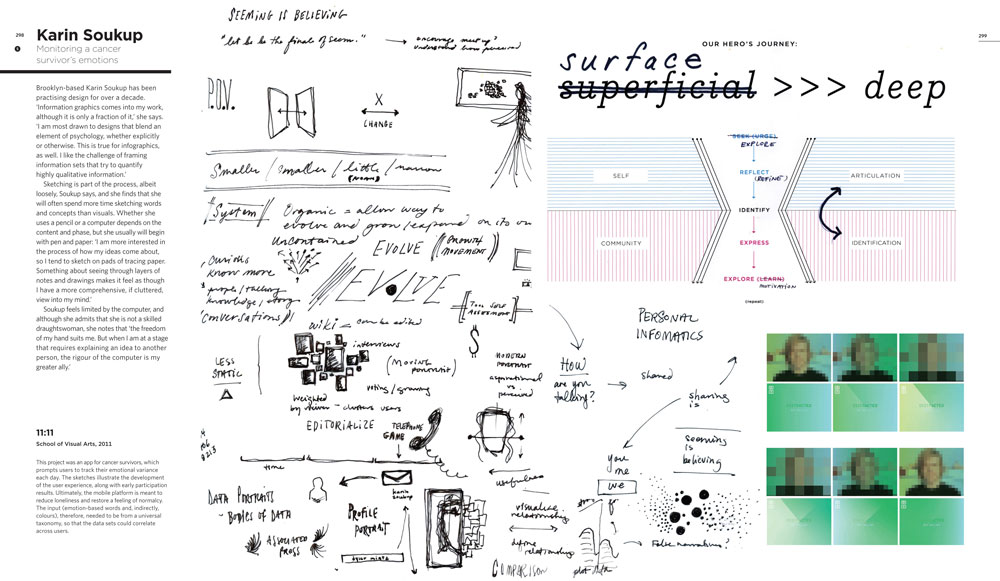
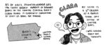
Book cover; early sketches of an app for cancer survivors, which tracks emotional variance © Karin Soukup, 2011
Heller, a design writer, historian, former art director for The New York Times and current co-chair of the MFA Design Program at the School of Visual Arts, has long loved sketchbooks for their insights into what people are interested in without creative directors or assignments guiding their work. “The nature of art is that an artist sketches,” he says in an interview with F Newsmagazine. “If you’re making something, you start with an idea, and to explain that idea, you usually sketch.”
In editing the book, Heller and Landers chose a range of examples, from practicing illustrators to reporters who lean towards graphics. All capture their creators’ inherent senses of exploration and wonder that emerged from a common starting point of raw data.
Information visualization is by no means a new field, but when asked about the surge of demand for the form over the past several years, Heller points to two factors. “Ultimately, it’s the deluge of information, and the need to consume that information in quick bites,” he explains. “We are faced with so many different platforms with so many different information conveyances that we need shortcuts. When you have an information graphic, you can digest a whole lot of material in a much shorter time than reading it and then having to read it again.”
Terminology to talk about information visualization is slippery, at best; art theory may be a means to critically develop a language to discuss visual forms, but data is inherently rooted in objective, rather than subjective, approaches. Heller notes, however, that there are always new terms that emerge with new technologies, as a result of those technologies. “We had never used the term ‘data visualization’ until fairly recently,” he says. “When Richard Saul Wurman coined the term ‘information architect’ [in 1976], he didn’t mean it to be what it means now. He meant that almost everyone who works in graphic communications is an ‘information architect’ because that’s what graphic design is all about: conveying information.”
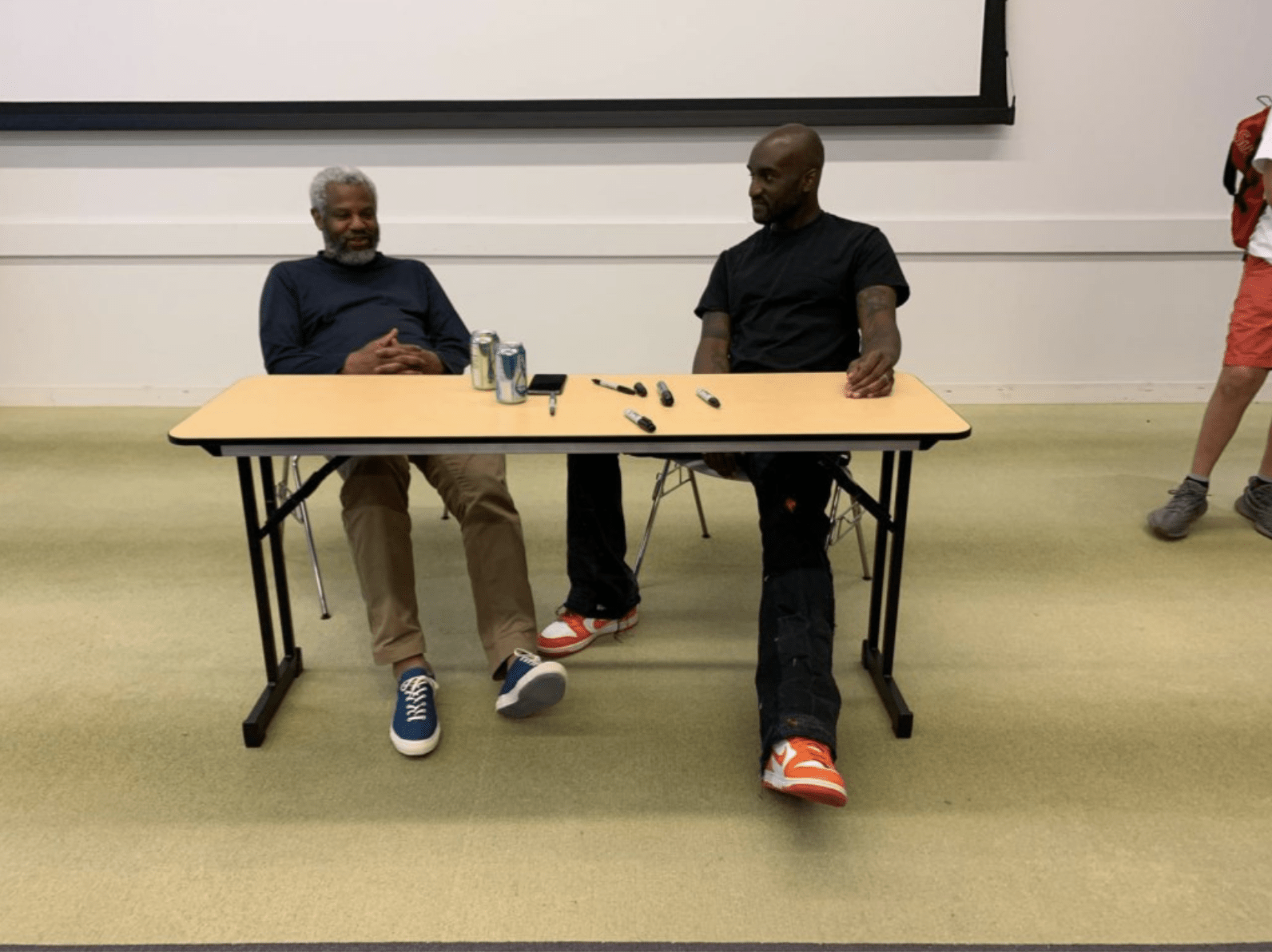
The work of the graphics department at the Chicago Tribune can speak to how infographics turn complex events and concepts into easily understandable narratives. The graphics team consists of journalists fluent in storytelling with data; their work process involves sketching out visual ideas to enhance the textual work of reporters and editors. The result is a process of writers and artists working together, and they find that story mapping (a technique of graphic organization to shape a story), paired with getting data on deadline, is key.
“In journalism, you have to fight for your data,” says Graphics Editor Jonathon Berlin. “The better the data, the better the story. You need to know your way around information, and be able to conceptualize it. You have to be able to look at a data set and see a story, or look at a reporter’s story and see another story within that.”
Graphics Producer Kyle Bentle adds that an ability to show one’s thought process behind an infographic is also key in telling stories with data, especially with online platforms. “It’s important to show what you were thinking, and how you got there,” he says.
One example that Bentle noted was coverage of the September 26, 2014 fire set by an employee at the Chicago Air Route Traffic Control Center in Aurora, Illinois, which affected thousands of flights. When that story first broke, the team began by posting simple Google Maps and Google Earth images that pinpointed the location of the facility in Aurora, on the Tribune website. Then, they followed those with a more detailed, custom map demonstrating the wider areas affected by the disruption. Finally, they added a screenshot from the flight-tracking website FlightAware to show the large gap in flights over the radar area covered by the center.
When asked about what makes a successful news infographic, Graphics Producer Kori Rumore says that narrative strength is key. “The most effective ones can stand on their own and tell the story, in addition to supporting it,” she says.
“There’s a trend to throw a huge amount of information at the reader all at once,” Bentle says. “But a clear path through all of that data, and a clear conclusion, makes an infographic a success.”
Heller agrees that infographics need to show clear paths through complex information, but feels that visual “allure” is also a key factor. “There needs to be something that gets you into the graphic itself, whether it’s a headline or a visual presentation. You need some kind of hook.”
Ultimately, it may come down to simple intellectual satisfaction paired with graphic appreciation. “You know you’ve gotten something out of an infographic when you come away feeling satisfied
that you’ve learned something new,” Heller says.
As with any presentation of factual information, be it an article about infographics or an infographic about writing an article, an engaging example may just leave curious consumers with more questions than answers.
Anna B. Smylie contributed reporting to this article
Story Mapping The Story
Writing an article about infographics is much like designing an infographic itself; it takes research, planning and a series of creative decisions in order to translate source material into a polished presentation of information. Here was the process of writing and designing this article: