The School of the Art Institute of Chicago’s annual Undergraduate Exhibition—or the BFA Show, as it is often termed—is a maze-like, often overwhelming conglomeration of highlights carefully self-selected from each student’s developing oeuvre. Even if you missed the opening night’s swamp-like heat and Obama-obsessed media blitz, the exhibition, on view for a two week run at SAIC’s Gallery 2 space, contained hundreds of works, and a number of similarities emerged from amid the two floors packed with art work. Corresponding with the art world’s perpetual interest in identity politics throughout the past several decades—which has been addressed with either nods of agreement or eye rolls of derision—a notable quantity of selections dealt with the transfer of personal issues to the public sphere.
Additionally, a number of BFA candidates’ chose to directly and consciously reference art history, displaying an awareness of the canon which these artists have inherited. Perhaps most overwhelmingly, however, many entries in this year’s show implemented sentimental evocations of childhood, works that were aesthetically saccharine in their use of cute and unoffensive imagery. The popularity of these themes—all of which have been and remain highly relevant to the contemporary art scene and market—and, especially, divergences from them, demonstrate the ability of a number of SAIC’s BFA candidates to engage critically and thoughtfully with the work and ideologies which have surrounded them for the past four or so years. F Newsmagazine Associate Editor Caroline Ewing and Art Criticism Editor Britany Salsbury visited the exhibition and selected some of the pieces which they felt represented the diversity of work exhibited in this year’s show.
Britany’s picks
P. Landis Blair’s installation includes four paintings and a number of small drawings, each of which approaches the much-scoffed-at art historical canon in unique and innovative ways. Blair’s large-scale-painting, Surprise!, is especially exemplary of this trend; a mouse lies dead and caught in a mousetrap that appears to be, strangely, located in a field. In striking contrast with the disgust that might be evoked by such a scene, Blair’s mouse is painted in a way that exemplifies remarkable attention to both form and technique. Surprise! fits comfortably in the long neglected legacy of the tragic beauty of Dutch vanitas painting. Rather than simply translating such a genre to the present day, however, the inexplicability of the mouse’s locale—in the sort of trap one might place in a home, but simultaneously outdoors—draws further upon the central theme of the work it seems to reference, taking the force of such tragedy to another level and giving the viewer much to consider.
Blair’s installation also includes two large untitled drawings which similarly draw upon both tradition and confusion; in one, for example, a woman sits reading a book. Behind her, stands a line reminiscent of a Depression-era unemployment queue. In this midst of this scene stands a crucifix with a holy figure—presumably God. The insertion of such traditional religious iconography into an already confusing image evokes questions of the relevance and translation of such images and their corresponding ideology into current artistic practice and culture. Additionally, they show a mature and developed understanding of both technique and history.
Caroline G. Hong’s submission consists of three dorm-room-style televisions lined up on a platform, each broadcasting interviews which she conducted with her mother and father. Hong asks questions that are difficult in their simplicity; those which would either spawn a manifesto from the philosophically inclined or a one word answer from others. Her father, for example, is asked who he is, and responds with a sort of frustrated confusion. The slight divergences in each display reflect this confusion. During Hong’s interview with her father, one camera loses its focus on him, moving, instead, to an empty compact disc case located on his desk. This movement seems to mirror the conversation itself, in which understanding itself is repeatedly dislocated.
Hong takes up a somewhat tired idea, the often unbridgeable generational gap between parents and their children, and literalizes it in a way that is both innovative and difficult to ignore. In one scene, for example, Hong’s mother yells at her to “be strong,” in a conversation that seems to focus on a failed relationship. Taken out of context in this way, such exchanges reveal the vast difference and the equally compelling desire to relate inherent to such universal relationships.
Amanda Gross, as her exhibition postcard says, makes “food art.” Her BFA installation involved a series of nine drawings of various sizes. Of these, roughly half were of food—particularly vegetables; monumental eggplants in the midst of buildings and colossal onions taking up the whole of each work’s visual space. Occurring in the midst of skillfully executed figural drawings, Ross’s representations of food are notable in that they command just as much attention and notice as the figures in her work.
Of these works, a small, more roughly executed sketch stood out as especially humorous, relevant, and smart. A donut, muffin, and caramel apple appear in the work, surrounded by text which reads “Okay but…I’d rather be eating!” Although there are innumerable relevant interpretations for the drawing—the mass media preference for unhealthily thin young women, the equally unhealthy move toward obesity in contemporary American society, postmodern appropriation of kitsch as artistic device, or even as corresponding with a current move toward the insertion of humor in art—it’s equally compelling to look at Ross’s drawing and think of the way in which, on the most basic level, you really do just want to eat the stuff in her drawing.
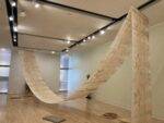
E. Suter’s work, MSG Chromophobia, is easily one of, if not the most, aesthetically interesting pieces in this year’s BFA show. The work, which is part watercolor, part installation, includes 18 small and two large works, as well as a wall painting, umbrella, and temporary tattoos which viewers were free to take with them. The smaller group of drawings served as the focus of the work; each contained ink drawings of women in various poses, increasingly obscured by bright patternings of watercolor. In the first image, for example, only a small section of turquoise and blue connecting to the woman is visible, while in the last image, only a vivid blurring of color is available.
Chromophobia is, curiously, listed in medical dictionaries as both an abnormal fear of colors as well as resistance to stains; Suter’s work both introduces the former as literal and realizes the latter definition as an impossibility. As such, the work serves as an excellent example of work in which neither content nor aesthetics are sacrificed at the cost of one another. Although the work contains an undeniable beauty, it simultaneously invites a consideration of the formal properties of watercolor as media and of the way in which color may function beyond mere opticality.
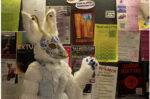
Of all the work exhibited within the two floors and numerous rooms of work at this year’s BFA show, perhaps the most outstanding was an installation of three photographs by Anthony Carfello, entitled Commencement. Each image represents the artist taking part in fictional rights of passage into the art world. In one, he is tattooed with the word “artist” (so, as his website says, “If I’m ever in an accident, the paramedics will know that this is not just any corpse they’re carrying, but one of an artist”), in another, Carfello is photographed at a debutante ball on the front steps of the Museum of Contemporary Art. In the first, and most on-point image, Carfello is drafted— à la college football—by a top gallery, receiving a hat that says “Artworld” and a jersey that reads “Emerging ’07.”
Extensive conversation has been initiated in regards to the direction of art after postmodernism, after much that can be done has been done. Carfello transforms the seriousness of this debate—and the sanctity of the artworld which values it—into one big, elaborate joke. Offensive, maybe; more significantly, though, Commencement is really apt and really, really funny. Carfello’s work demonstrates a mature and intelligent understanding of both the impenetrability of the art market as well as the issues that plague contemporary critics and theorists. Instead of frustratingly attempting to work within the confines and dictates of such institutions, he addresses them directly. Carfello makes a number of joking allusions to being an artist to watch, but in this humor, there is, ultimately, a lot of truth.
Caroline’s picks
On the upper floor of the exhibition, Christopher Strobe Connell’s three large untitled drawings depicting vertical snowy landscapes present symbolic questions of man versus nature, labor, and loneliness. With the most minimal of means and expression, wood, water, and animals do the talking, as each laboriously detailed drawing depicts evidence of equally obsessive collections amidst backdrops devoid of human presence. Connell posits scenes starkly contrasting a strangely American rugged necessity with a refined attention to detail, devoid of any sentimentality, while alluding to meaning of a higher order than a mere love of nature.
Instead, the clichéd question of “If a tree falls in a forest…” comes to mind in relation to Connell’s work. In one drawing, an orderly, massive column of neatly stacked firewood is capped with a tidy layer of snow. Its density and size contrasts strongly among the stick-thin saplings which surround it. Too tall to be a “true” woodpile, we are left to our imagination as to what the purpose could be—is this intended as a ritual action or as a preparation for a future lack of firewood? The theme of plentitude and foresight is treated in a very different light in another drawing. An inverse of the first, perhaps, it depicts a cross-section view of a deep, narrow well made of stone dug into the earth. An empty wooden bucket hangs mournfully at the bottom of the dry well, expressive of absence, anticipation, and loss. Reminiscent of another artist’s work—Robyn O’Neil’s apocalyptic snow scenes—Connell’s skillful, delicate drawings invite the viewer to imagine how and why these scenarios came into being while maintaining a formal regularity that allows for a quietly meditative interpretation on the parallel between natural and man-made creations.
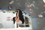
One of the most popular works during the exhibition’s opening night was Robert Mueller’s Rodeo Wheelchair, which is, in addition to being aesthetically engaging, an elegantly simple statement on what we mean by the terms “ability” and “disability.” Consisting of a standard, hospital-issue wheelchair turned kinetic sculpture, at the push of a button the wheelchair, contained by three blue walls (the color evokes the “handicapped” hue prevalent in parking lots), begins to rotate, occasionaly bucking wildly forwards and backwards.
The piece engages viewers not only by breaking the “do not touch” rule (I noticed several people tentatively approach the button, glancing furtively around the room), but it also asks you to conceptually “sit” in the chair that doesn’t actually let you sit still. The chair is propelled by a hydraulic system connected by a bright yellow cord suspended from the ceiling, which, intentionally or not, combined with the blue walls, connotes a poppy/institutional flavor to the installation. Mueller’s work, however, is more than a simple experiment with hydraulics and moving parts; although it is “fun” to look at, the wheelchair in itself takes on a deeper significance. His “logo” is a play on the universal sign for “handicapped”; in Mueller’s version, however, the generic person is tilted out of the chair, in mid-air, as he/she is separated from the former prosthesis (which, without its “person” is revealed to be nothing more than a segmented “C”) in a moment of liberation from his/her former attachment. As a physical incarnation of this logo, Rodeo Wheelchair, in one simple gesture, tweaks our perception of this everyday object and the imagery related to it. The wheelchair, normally propelled by the user’s own arms, comes to life.
Dignity, agency, and control are all bound up in what parts of your body can move, and what inanimate objects mean when they are employed to help you move through the world. The most interesting thing about Rodeo Wheelchair is that, by incorporating an object so highly charged (literally, in charge of) with the body’s movement, the mere absence of the body challenges notions of “disabilities” which are tied up with how differences in movement and capability are perceived in society.
Another work that references “disabilities” or differences in physical ability is Deanna Harris-Dwork’s Find Me So That I Will Exist. Among a plethora of cloth and craft-oriented works in the BFA exhibition, Harris-Dwork’s is singular in that it references fields outside of its materiality, namely science, optics, and even painting. A cotton and polyester quilted piece hung on the wall, Find Me is not only the title, but a command as to how to look at the work. Based on the Ishihara color blindness test, given to distinguish between people with Red-Green color blindness and those with “color-normal” vision. To this “normal” viewer, the quilt reveals the word “ME” at the center of the circle within numerous red, orange, and green quilted cloth circles. To a color-deficient person, the quilt would ostensibly reveal nothing but polka dots of varying shades of color. In this way, the title also addresses issues of subjectivity, idenitifcation, and naming. As the quilt’s maker, Harris-Dwork seems to be saying that not only is a part of her in the work, that you can, by “seeing” her, make her appear. The relative arbitrary result of who can “see” Harris-Dwork in the work says much about different types of visibility, both metaphorical or real.
There were several curated sections in the BFA show this year, one of which, Here and Elsewhere includes the symbolically melancholy work of Harley David Young. Untitled consists of an oversized black skull covered to differing degrees with tar, moss, and goldleaf. Tongue-in-cheek and deadly serious at once, Young’s earthy, aged skull was one work among those by five other artists in the show (several using sound and video) dealing with issues of perception, landscape, time and historical awareness. Tilting forward from a pile of fertilizer-speckled soil, the skull is at once sculpture and a site for landscape imagery. Miniature trees, bones, and moss connote a mixture of Lilliputian myths, archaeological metaphors, and a Goonies-style sensibility. Untitled seems both alive and dead in the gallery; the eye sockets inlaid with gold leafing, the trees and hair-like moss imply the skull as a source of life while remaining a type of memento mori, or a portent of bad things to come or to resurface. Young’s statement explains that Untitled is “representing the remains and discoveries from a controlled excavation of the land and its structures.” The success of Young’s piece is that the depressingly grim statement inherent in presenting a giant skull is balanced with a glittering, fantastical, youthful attitude towards this very subject, allowing us to have our skull and love it too.
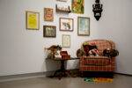
It was difficult to overlook Peter Green’s installation, which included a tidy display of diverse objects such as hammers, tarot cards, hand-made axes, and a home-made wire sculpture perched on a table at center. The objects and the altar-like manner in which they are arranged are left to speak for themselves; paradoxically, Green signed the “corner” of his installation in a gesture which harkens back to modernist conceptions of the artist as creator of a singular vision. His project, however, aims directly at the gap between an artist and his/her materials. The viewer is left to deal with the objects alone, but the organizing concept is ultimately personal in nature. These are the tools, the finished and unfinished projects that Green himself has struggled with for four years.
Says Green of the piece: “I wanted to have a variety of works I’ve made during my time at SAIC, as a self portrait of my development.” An email from a tool manufacturing company is pinned to the wall, a relic from Green’s “hammer project,” explaining that they cannot give him any more information on the topic he is interested in. What did Green want to know, and why? The question is left unanswered, but these vignettes of the contemporary artistic practice, when juxtaposed in the same space, offer a reflexive, and even sentimental take on the progression of an undergraduate student passing through the very unique environment-experience of art school.