The two hours before the MFA show's official opening is, in my opinion, the perfect opportunity to fully take in the exhibition; between sips of free wine, and with the hint of excitement that precludes any event of its kind, it should be offered to all those who can stomach two massive floors full of art. There was an undeniable buzz in the air, along with an unidentified group of people strumming guitars and singing haphazardly on the first floor of the show. Nonetheless, for those who had the chance to see the BFA exhibition in April, the graduate exhibition was definitely a more reserved affair, with additional years of artistic experience relating a more tempered, considered approach to art making that unfortunately made me wonder at times if being an artist had anything to do with enjoying it. All in all, the MFA exhibition was a pretty dark affair; peppy, or even positive art was in short supply. Even works that at first looked familiarly "happy" (stuffed animals, bright colors, etc.) soon revealed themselves to be sardonic takes on moralistic themes, invited you into someone's post-pubescent narcissistic stage, or encouraged you to reflect on your own dark underbelly.
 I took it upon myself to focus on the work that refused the all-too-easy angst-ridden perspective that prevailed; peppered throughout were works that invited collaborative viewership and posited situations for viewers to engage more thoughtfully upon the practice of art making in general. Fi Jae Lee's "The Massacre of the Selfish Jesus" was, hands down, the most thoroughly engaging, and generous work in the entire exhibition. Those who were lucky enough on opening night to see the performance which completes the installation, witnessed a rare act of selflessness on the artist's part (Although she stood at the center of the piece, Lee was literally hidden from view, ensconsced by her own stuffed cloth contraption-creatures). Lee had two assistants present, one of whom invited people to draw "a picture of someone you hate," or an "obstacle," on red dinner-plate size circles of construction paper. Afterwards, another assistant who waded around in a shallow pond-tub of red water, brought the drawing to Lee, who ceremoniously sliced the paper with a guillotine. On either side of the octopus-like stuffed cloth sculpture that contained the artist were small 2-D neon works which seemed unnecessary and at odds with the natural, ethereal air of the rest of the installation. Decapitated pieces of paper floated in the "pond" like lily-pads as music (also created by Lee) played in the background. The music was a comforting, whimsical assortment of whistles, humming, and meandering electronic stanzas. People stood around "The Massacre of the Selfish Jesus," seemingly in awe of such a genuine attempt at healing, communication, and sacrifice on her part, as "the selfish Jesus," for all of us. I took it upon myself to focus on the work that refused the all-too-easy angst-ridden perspective that prevailed; peppered throughout were works that invited collaborative viewership and posited situations for viewers to engage more thoughtfully upon the practice of art making in general. Fi Jae Lee's "The Massacre of the Selfish Jesus" was, hands down, the most thoroughly engaging, and generous work in the entire exhibition. Those who were lucky enough on opening night to see the performance which completes the installation, witnessed a rare act of selflessness on the artist's part (Although she stood at the center of the piece, Lee was literally hidden from view, ensconsced by her own stuffed cloth contraption-creatures). Lee had two assistants present, one of whom invited people to draw "a picture of someone you hate," or an "obstacle," on red dinner-plate size circles of construction paper. Afterwards, another assistant who waded around in a shallow pond-tub of red water, brought the drawing to Lee, who ceremoniously sliced the paper with a guillotine. On either side of the octopus-like stuffed cloth sculpture that contained the artist were small 2-D neon works which seemed unnecessary and at odds with the natural, ethereal air of the rest of the installation. Decapitated pieces of paper floated in the "pond" like lily-pads as music (also created by Lee) played in the background. The music was a comforting, whimsical assortment of whistles, humming, and meandering electronic stanzas. People stood around "The Massacre of the Selfish Jesus," seemingly in awe of such a genuine attempt at healing, communication, and sacrifice on her part, as "the selfish Jesus," for all of us.
 Justin Goodall's works break the boundaries of what we think of when we think "ceramics." There are no inert, dense, earth-bound objects in Goodall's installation. Here, ceramic droops, hangs, dangles, and reaches skyward. "Work and Play 2"(2007) is made of porcelain tube segments, each positioned at a different angle and strung together by wire. Like the title, the work was a delicate investigation of the tension between form and materiality with the simplest of means. Movement and rigidity, hollow versus solid, opacity, lightness and density, and a definite lyrical trait applied to ceramics, are the primary modes through which Work and Play 2 functions as a fascinating jumping off point for new conversations on what sculpture can do. Goodall (who will begin a teaching position in ceramics at Elon College this fall) is mining minimalist sculptural tactics for new takes on how ceramics, one of the oldest mediums ever used, can fit into evolving sculptural dialogues. Justin Goodall's works break the boundaries of what we think of when we think "ceramics." There are no inert, dense, earth-bound objects in Goodall's installation. Here, ceramic droops, hangs, dangles, and reaches skyward. "Work and Play 2"(2007) is made of porcelain tube segments, each positioned at a different angle and strung together by wire. Like the title, the work was a delicate investigation of the tension between form and materiality with the simplest of means. Movement and rigidity, hollow versus solid, opacity, lightness and density, and a definite lyrical trait applied to ceramics, are the primary modes through which Work and Play 2 functions as a fascinating jumping off point for new conversations on what sculpture can do. Goodall (who will begin a teaching position in ceramics at Elon College this fall) is mining minimalist sculptural tactics for new takes on how ceramics, one of the oldest mediums ever used, can fit into evolving sculptural dialogues.
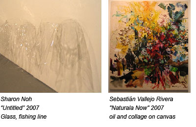
 On a similar note, Sharon Noh's glass sculptures were easy to overlook, but once noticed, demanded a careful moment of looking from the viewer. Every component of the work is practically transparent, yet rigidly constructed; fishing line is as tight as guitar strings; tiny holes penetrate the glass in perfect geometric order. With such a preponderance of sculpture, video and new media work, installation and fiber-related pieces, I started to wonder where all the painters had gone. Ezara Hoffman's striking canvases were some of the first pieces on view upon entering the exhibition, but on the whole, painters were few and far between. One of the few examples of (almost) pure, unadulterated painting was Sebastian Vallejo Rivera's "Naturala Now," (2007). Although I wondered whether Rivera's signature on the front of the canvas was a sarcastic gesture or a throwback to the 19th century, all in all the large-scale oil and collage on canvas was a refreshingly exuberant break among a lot of angst and navel-gazing. On a similar note, Sharon Noh's glass sculptures were easy to overlook, but once noticed, demanded a careful moment of looking from the viewer. Every component of the work is practically transparent, yet rigidly constructed; fishing line is as tight as guitar strings; tiny holes penetrate the glass in perfect geometric order. With such a preponderance of sculpture, video and new media work, installation and fiber-related pieces, I started to wonder where all the painters had gone. Ezara Hoffman's striking canvases were some of the first pieces on view upon entering the exhibition, but on the whole, painters were few and far between. One of the few examples of (almost) pure, unadulterated painting was Sebastian Vallejo Rivera's "Naturala Now," (2007). Although I wondered whether Rivera's signature on the front of the canvas was a sarcastic gesture or a throwback to the 19th century, all in all the large-scale oil and collage on canvas was a refreshingly exuberant break among a lot of angst and navel-gazing.
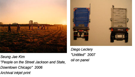
 Seung Jae Kim's "People on the Street, Jackson and State, Downtown Chicago" (2006) is part of a series entitled, "Visual Shifts," in which he photographs people crossing the street in the Loop, and prints life-size cutouts of them, which he then positions in completely different contexts (this image was photographed "somewhere in Schaumburg"). Just as the unremarkable title suggests, the mundane is easily reversed if even one supporting structure is shifted. The mundane turned special was a repeating theme in the exhibition. Another good example of work that challenges you to re-think everyday forms was Diego Leclery's paintings of the backs of trucks are immediately appealing for their cartoon-like appearance, but there is more at stake here than pure pleasure. There are several things at play here; one is his questioning of "how things pass for art, and why," or "what makes painting impressive." These fundamental concerns anchor the trucks in a much larger aesthehic and art historical conversation, turning the everyday sight of the back of an 18-wheelers into a vehicle (pardon the pun) for asking the question, "Why do we even like to look at things?" What is the difference between enjoying the back of a truck while you're in the passenger seat of your mom's Minivan and enjoying the same thing in an art context? Leclery even goes as far as to link his work with the "early-Stella reiteration of support shape through line and color." Hence the shape of the truck dictates the form within. Seung Jae Kim's "People on the Street, Jackson and State, Downtown Chicago" (2006) is part of a series entitled, "Visual Shifts," in which he photographs people crossing the street in the Loop, and prints life-size cutouts of them, which he then positions in completely different contexts (this image was photographed "somewhere in Schaumburg"). Just as the unremarkable title suggests, the mundane is easily reversed if even one supporting structure is shifted. The mundane turned special was a repeating theme in the exhibition. Another good example of work that challenges you to re-think everyday forms was Diego Leclery's paintings of the backs of trucks are immediately appealing for their cartoon-like appearance, but there is more at stake here than pure pleasure. There are several things at play here; one is his questioning of "how things pass for art, and why," or "what makes painting impressive." These fundamental concerns anchor the trucks in a much larger aesthehic and art historical conversation, turning the everyday sight of the back of an 18-wheelers into a vehicle (pardon the pun) for asking the question, "Why do we even like to look at things?" What is the difference between enjoying the back of a truck while you're in the passenger seat of your mom's Minivan and enjoying the same thing in an art context? Leclery even goes as far as to link his work with the "early-Stella reiteration of support shape through line and color." Hence the shape of the truck dictates the form within.
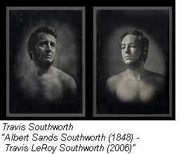
 One artist who does not confuse self-reflection with self-aggrandizement to the exclusion of the outside world is Travis LeRoy Southworth. His interest in investigating the ways maleness play out in representation and self-representation is evident in the dialogically touching and well-crafted work, "Albert Sands Southworth (1848) - Travis LeRoy Southworth (2006)." Southworth's work was included in Our Are, a curated section of the exhibition organized by Lisa Wainwright and Maxwell Graham which also included the work of Helene Maureen Cooper, Marc Adelman, Chase Browder, Scott Patrick Wiener and Regina Mamou. Albert Sands Southworth... consisted of two daguerrotypes, the former of Albert Sands Southworth a (perhaps) distant relative of the artist who also happened to be an early developer of photography in New England, and the latter of the currently living artist, who positions his own portrait facing the elder artist. Both men are topless, and both gaze into the distance. Albert Southworth's countenance presents a strained, almost soul-achingly wistful face that bucks the trend of much 19th century portraits, in which men are hardened and stoic in their resolve. Travis, on the other hand, does not attempt to replicate his forebearer's gaze (it seems this would be almost impossible), but presents his own version of maleness, one perhaps rooted less in dramatic flourishes, but one which is, all the same, very much self-aware of the vulnerability involved in this gesture a century and a half later. One artist who does not confuse self-reflection with self-aggrandizement to the exclusion of the outside world is Travis LeRoy Southworth. His interest in investigating the ways maleness play out in representation and self-representation is evident in the dialogically touching and well-crafted work, "Albert Sands Southworth (1848) - Travis LeRoy Southworth (2006)." Southworth's work was included in Our Are, a curated section of the exhibition organized by Lisa Wainwright and Maxwell Graham which also included the work of Helene Maureen Cooper, Marc Adelman, Chase Browder, Scott Patrick Wiener and Regina Mamou. Albert Sands Southworth... consisted of two daguerrotypes, the former of Albert Sands Southworth a (perhaps) distant relative of the artist who also happened to be an early developer of photography in New England, and the latter of the currently living artist, who positions his own portrait facing the elder artist. Both men are topless, and both gaze into the distance. Albert Southworth's countenance presents a strained, almost soul-achingly wistful face that bucks the trend of much 19th century portraits, in which men are hardened and stoic in their resolve. Travis, on the other hand, does not attempt to replicate his forebearer's gaze (it seems this would be almost impossible), but presents his own version of maleness, one perhaps rooted less in dramatic flourishes, but one which is, all the same, very much self-aware of the vulnerability involved in this gesture a century and a half later.
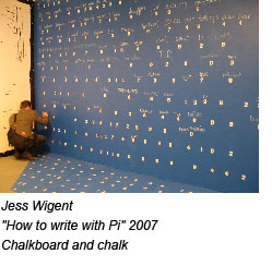
 "How to Write with Pi" (2007), by Jess Wigent, is another example of a succesfully engaging atempt at collaborative artworks. Wigent, who graduated with her MFA in Writing this year, created a large wall on which the numbers of Pi were arranged in a grid. Chalk was provided to viewers, who could write a word under each number, the stipulation being that the number of letters in the word matched the number above it. The title explains the beauty of the concept, being that Pi is a never-ending sequence of numbers, and that, theoretically, the words associated with Pi is an un-finishable piece of writing. When I saw the piece an hour into the opening, people had already written words in Arabic, Chinese, and Spanish, which Wigent explained was perfect for the project. Wigent's work is yet another example of the cross-discipllinary nature of SAIC's graduate programs. Wigent was not the only writer to present visual work in the exhibition - Louie Holwerk's cast wax and found object sculptures demonstrate the extent to which we can the school encourages students to expland beyond their supposed "field." It would be impossible to encapsulate all the work shown in the MFA exhibition, but it seems accurate to say that a strong undercurrent propelling much of the work is expanding beyond any discreet "field." Whether this means moving beyond apathy for viewers and artists both, or expanding beyond painting into collage, or pressing people to express their fears in a ritualistic healing act, the best work at the MFA exhibition pushed outside of itself, making you aware that "connecting" doesn't always have to be as overly-sentimental as it seems. "How to Write with Pi" (2007), by Jess Wigent, is another example of a succesfully engaging atempt at collaborative artworks. Wigent, who graduated with her MFA in Writing this year, created a large wall on which the numbers of Pi were arranged in a grid. Chalk was provided to viewers, who could write a word under each number, the stipulation being that the number of letters in the word matched the number above it. The title explains the beauty of the concept, being that Pi is a never-ending sequence of numbers, and that, theoretically, the words associated with Pi is an un-finishable piece of writing. When I saw the piece an hour into the opening, people had already written words in Arabic, Chinese, and Spanish, which Wigent explained was perfect for the project. Wigent's work is yet another example of the cross-discipllinary nature of SAIC's graduate programs. Wigent was not the only writer to present visual work in the exhibition - Louie Holwerk's cast wax and found object sculptures demonstrate the extent to which we can the school encourages students to expland beyond their supposed "field." It would be impossible to encapsulate all the work shown in the MFA exhibition, but it seems accurate to say that a strong undercurrent propelling much of the work is expanding beyond any discreet "field." Whether this means moving beyond apathy for viewers and artists both, or expanding beyond painting into collage, or pressing people to express their fears in a ritualistic healing act, the best work at the MFA exhibition pushed outside of itself, making you aware that "connecting" doesn't always have to be as overly-sentimental as it seems.
|